Infographic of the Day: Migration Flows in the US in the Last 200 Years
The video shows the period between 1820 and 2013.
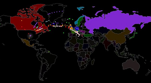
The authors of Metrocosm, a website that visualizes data, released a 1.5-minute video, where they showed, which countries the migrants who came to the US in the last 200 years came from.
Every dot on the map is equal to 10,000 people, and the brightness of color representing each country depends on how many migrants came from this country to America.
The authors based their visualization on the information from the US Department of Homeland Security.