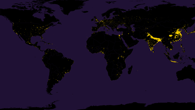
Infographic of the Day: 1% of the Earth Where Half of Its Population Lives
The most densely populated areas of the planet in Metrocosm infographic.
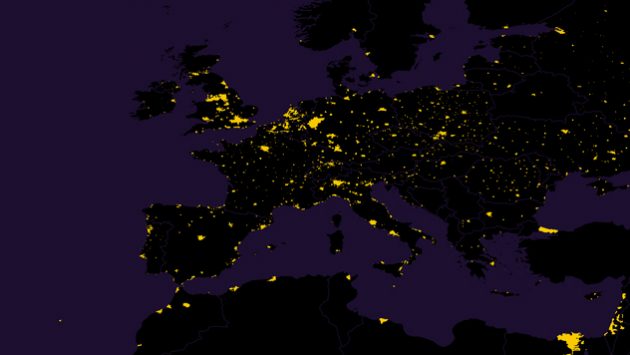
Metrocosm published an infographic which shows on the map how overpopulated some of the areas on the planet are: places where half of the population of Earth lives is marked with yellow, and other territory is black.
The authors says that the map is made of 28 million dots, each of them representing the area of nine square miles. Yellow dots are only 1% of all dots.
The map called World Population is also available in high resolution.


