Infographic of the Day: What the World Eats
National Geographic has visualized food products that were part of the daily diet in 22 countries of the world for the last 50 years.
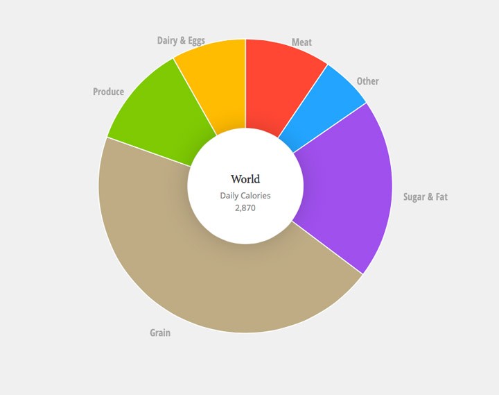
National Geographic published a new infographic: What the World Eats. It shows how the food basket of the planet has changed from 1961 to 2011. It provides details about the daily diets of people from 22 countries from different levels of economic growth. The infographic also provides data about how many grams of food and calories people of the planet consume on average.
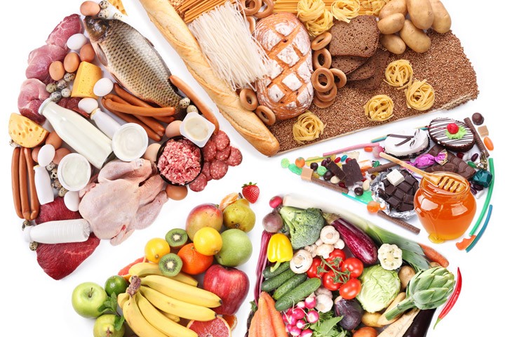
(Photo on the cover: Depositphotos)