5 resources that inspire designer Sergey Rodionov
In column Resources representatives of artistic professions talk about the sites they regularly visit in search of new ideas. Today’s issue is about tastes and preferences of designer Sergey Rodionov.

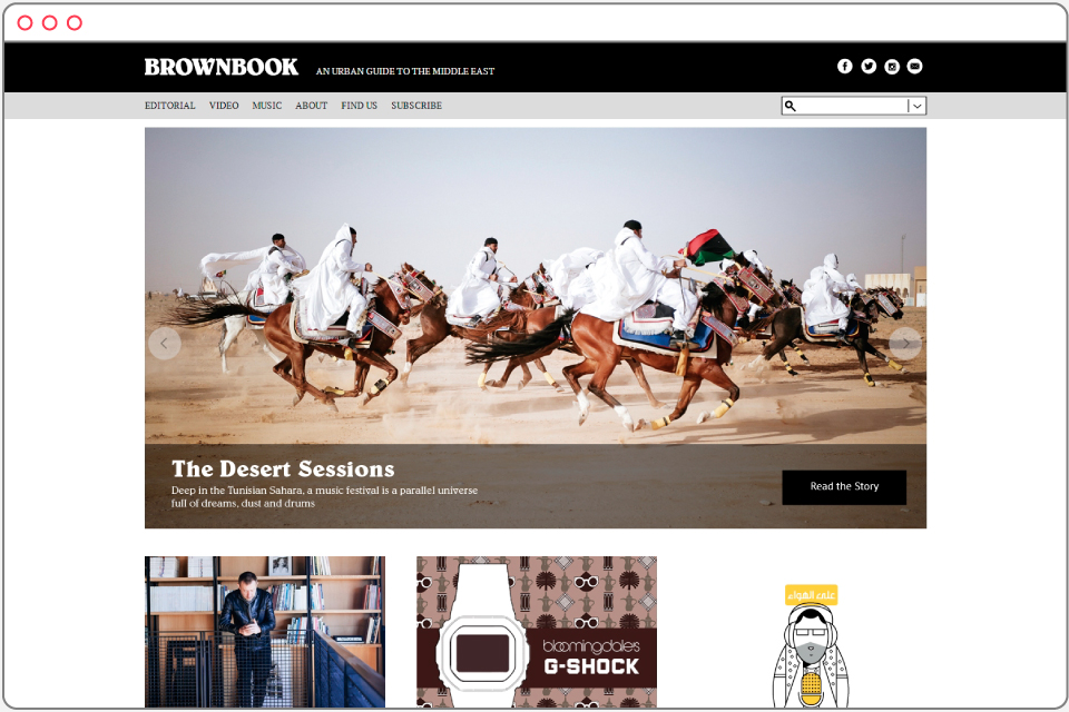
Most of all I get inspired by different books and magazines. I greatly relate to the style of Brownbook, a guide to the Middle East, to Mark, a Japanese magazine about fitness and track (the printed version — because its site design is unremarkable), and to Monocle, a British publication. Besides the fact that resource Brownbook is regularly updated, their photos of characters within urban environment seem very interesting.
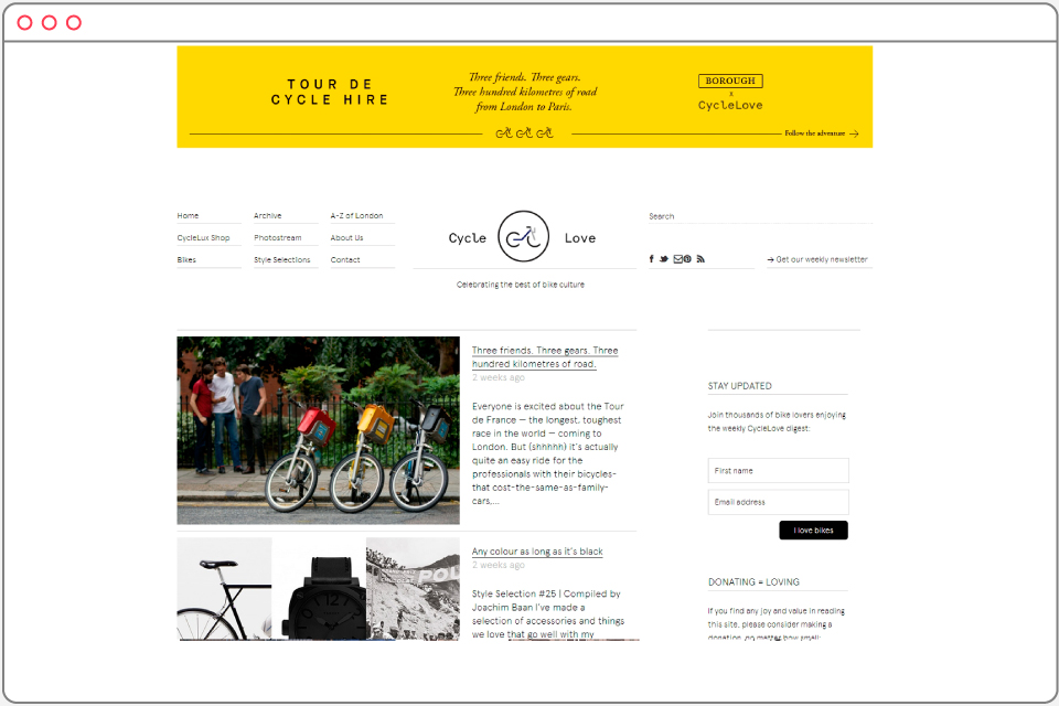
This resource is devoted to cycle culture and the design projects that have to do with bicycles. I like it all very much – every year The Village team organizes a bike festival.
Speaking of work, my every project begins with selection of pictures to set the mood — when I see a site, a logotype, a design style or an illustration for a column. Under my profile I collect pins from my friends, designers, and search for something, or upload my own shots and sketches for illustrations.
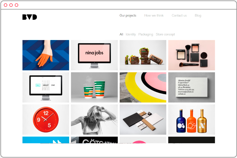
BVD is a studio in Stockholm. I like their simple, minimalistic style. I think that’s exactly how modern things should look like.
Another resource I feel very close to is The Dinner Conciegre. I like when food is photographed the way they do it: realistically, without adornment, slightly clumsy, with crumbs, drops, spilled oil and other perfect imperfections.
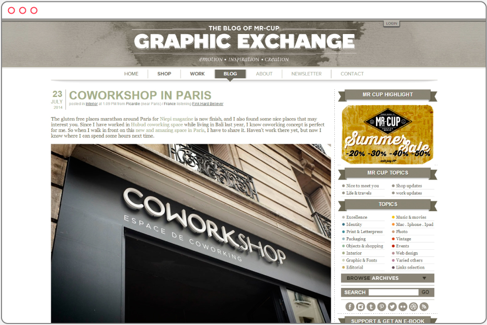
This blog is my favorite collection of beautiful projects in graphic design and other areas. The author of The Blog Of Mr-Cup is wonderful French designer Fabien Barral, his work in embossing technique deserves taking a look at separately.
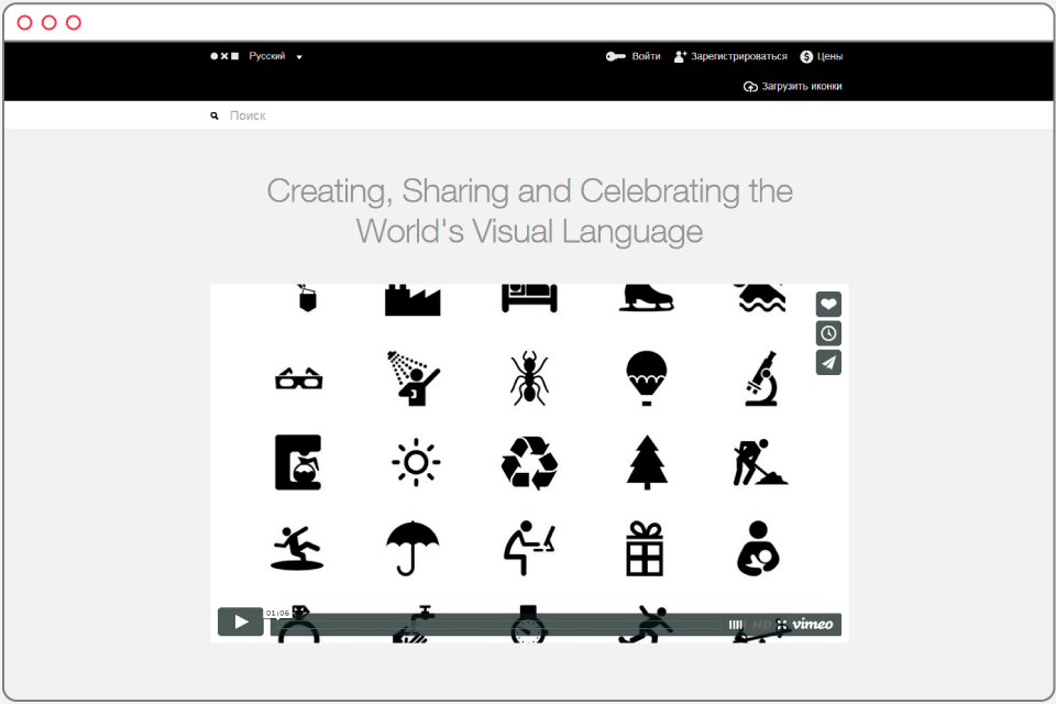
It’s an excellent library of symbols and icons. When creating icons for The Village we often used templates from The Noun Project, slightly modifying them. Now I turn to this resource when I’m preparing simple or complex illustrations, or offsetting margins.
New and best
