Graduate Student Redesigns Dollars

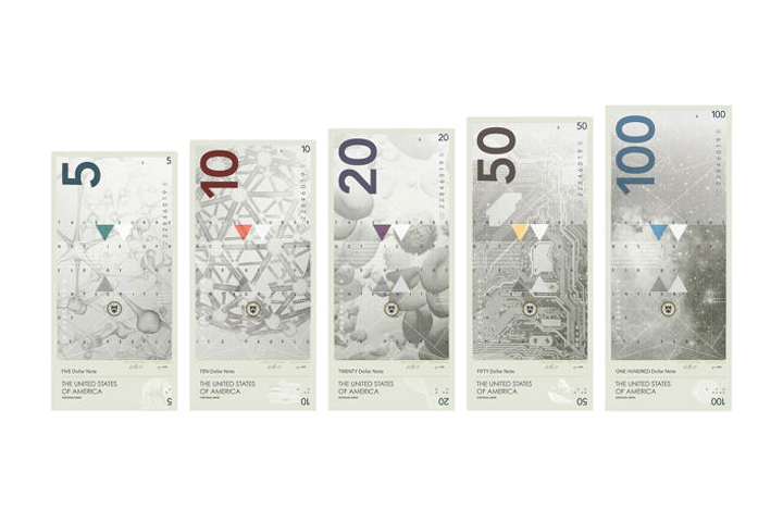
For his thesis as a student of the Basel School of Design in Switzerland, Travis Purrington created a new version of US currency. Travis added the symbols of US science, business, art and architecture to the new model and to changed the green ink.
The new design was inspired by the Swiss franc, which changes its appearance every 20 years, and by an avant-garde project developed in 1991 by Wemer Jeker.
In his interview to fastcodesign.com Purringtom said that from time to time people should test the functionality of frequently used objects. His design has a vertical layout because it reflects the position in which we hold money.
Readers of the Reddit, where the project was published, have criticized the designer for erasing national symbols. Jeker replied that he re-designed the images of an eagle, flag and stamp of the treasury.
{ “img”: “/wp-content/uploads/2014/10/3037579-slide-s-7-the-dollar-is-too-jingoistic-heres.jpg”, “text”: “” },
{ “img”: “/wp-content/uploads/2014/10/3037579-slide-s-5-the-dollar-is-too-jingoistic-heres.jpg”, “text”: “” },
{ “img”: “/wp-content/uploads/2014/10/3037579-slide-s-2-the-dollar-is-too-jingoistic-heres.jpg”, “text”: “” },
{ “img”: “/wp-content/uploads/2014/10/3037579-slide-s-3-the-dollar-is-too-jingoistic-heres.jpg”, “text”: “” },
{ “img”: “/wp-content/uploads/2014/10/3037579-slide-s-4-the-dollar-is-too-jingoistic-heres.jpg”, “text”: “” },
{ “img”: “/wp-content/uploads/2014/10/3037579-slide-s-1-the-dollar-is-too-jingoistic-heres.jpg”, “text”: “” },
{ “img”: “/wp-content/uploads/2014/10/3037579-slide-s-9-the-dollar-is-too-jingoistic-heres.jpg”, “text”: “” },
{ “img”: “/wp-content/uploads/2014/10/3037579-slide-s-10-the-dollar-is-too-jingoistic-heres.jpg”, “text”: “” },
{ “img”: “/wp-content/uploads/2014/10/3037579-slide-s-11-the-dollar-is-too-jingoistic-heres.jpg”, “text”: “” },
{ “img”: “/wp-content/uploads/2014/10/3037579-slide-s-13-the-dollar-is-too-jingoistic-heres.jpg”, “text”: “” }


