Infographic of the Day: Interactive Map of the World Population Density
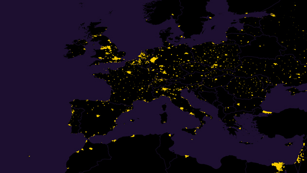
Luminocity shows the most densely populated regions of the Earth.
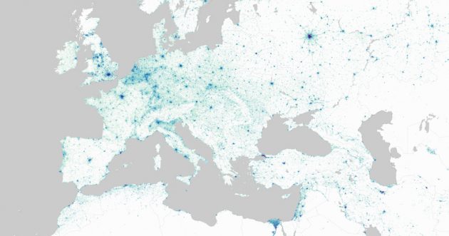
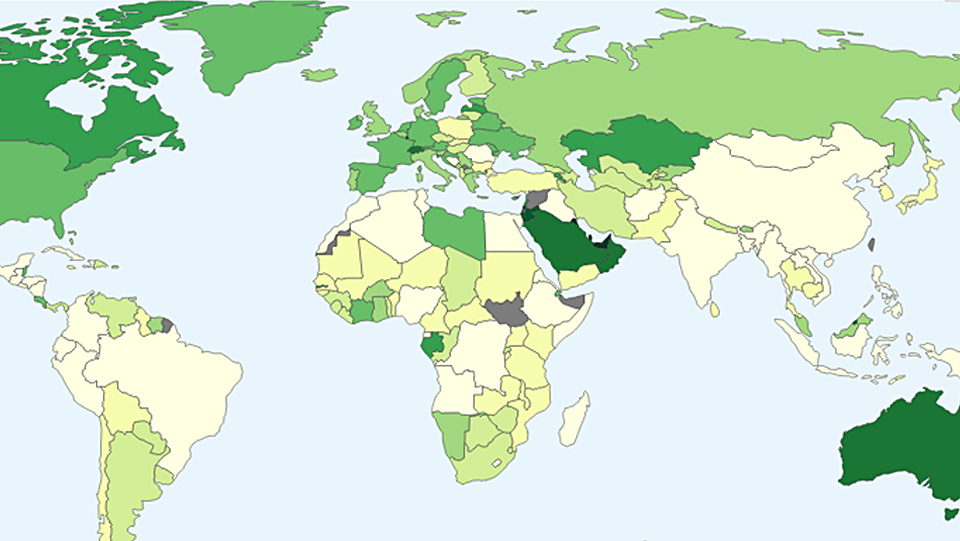
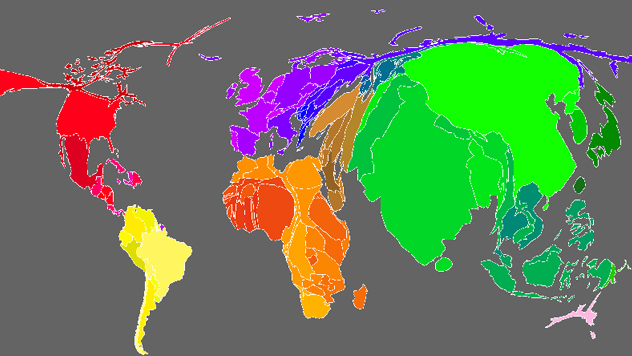
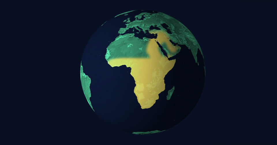
Duncan Smith, a researcher at the University College London, developed an interactive map with information about population density in different parts of the planet.
The project description says that to create the final visualization he used the data from national censuses and analyzed numerous satellite images of the Earth.
Users may zoom in the map to take a closer look at population density data in different regions and choose the visualization mode: for instance, interactive mode allows users to see statistics for each of the countries when placing a cursor on it.