Infographic of the Day: Which Part of the Population Are Migrants
Visualization includes the data between the 1960s and 2010s.

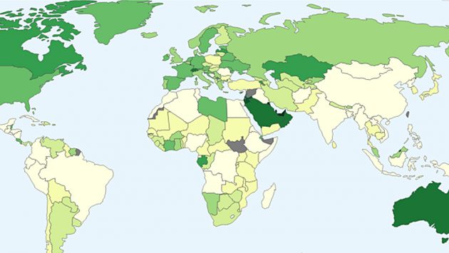
New York Development Research Institute published an infographic where it showed the percentage of people born outside a certain country in the population of this country.
The visualization is done on the world map and cover the period between 1960s and 2010s: by pressing on the country, user sees both the current data and how it changes over the past 50 years.
The authors say they based their project on data provided by the World Bank.


