Infographic of the Day: Map of the World by GDP, Population, and State Debt
Metrocosm compared socioeconomic indicators of different countries.
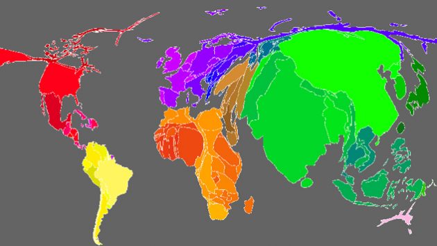
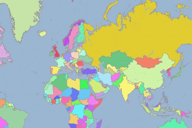
Metrocosm released an interactive infographic, How We Share the World, where the authors show how socioeconomic indicators compare for different countries on the world map.
Depending on the information that the user is looking at — GDP, population, state debt, or the number of billionaires — the size of the territories the countries occupy changes depending on this country’s ranking by this indicator.
According to the authors, they used the annual reports of the Credit Suisse Research Institute and Wealth-X financial company for their project.