Designer Offers Improvements on Oscar Award Cards
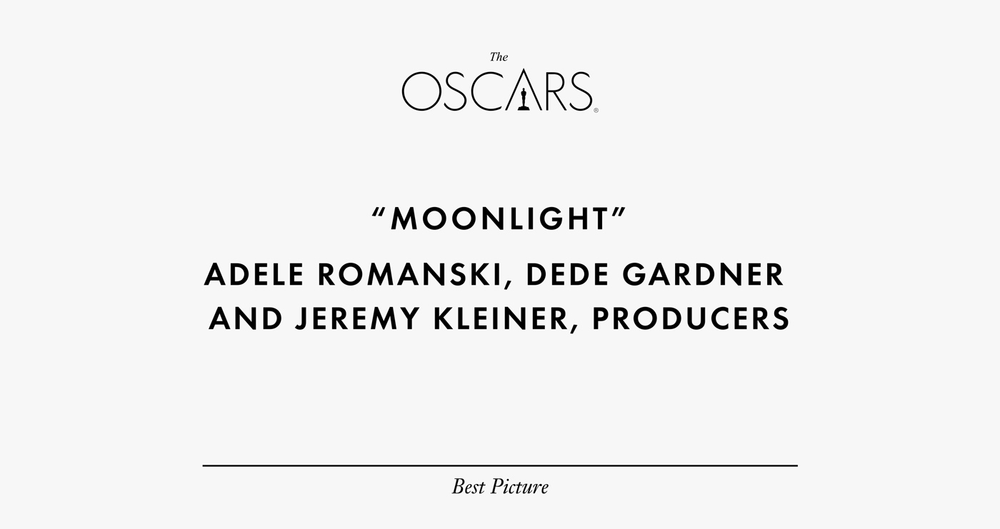
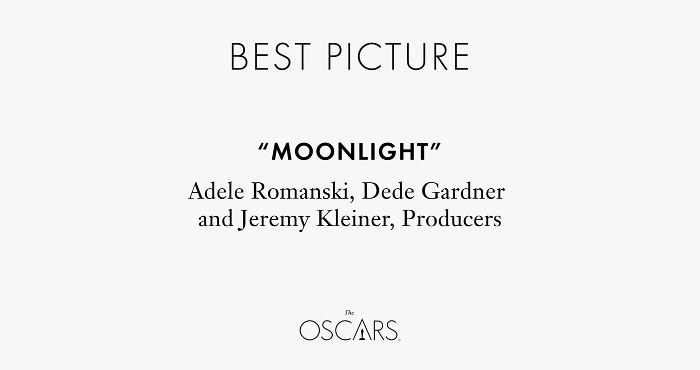
Jameson paid attention to the fact the the main element on the card was the logo of the award: it is placed on top and is written in the largest font. The name of the winning movie is in bold, but it is written in the same style as the names of people who will be called up on stage to receive the award. The name of the nomination is written in small font and placed at the very bottom of the card.
The original design of the card was developed by PricewaterhouseCoopers, and Jameson altered it as a personal project. In his version, the name of the nomination is typed in the largest font and moved to the top. The name of the award-winning movie has the same style , but is now different from the names, which are typed in regular font. The logo of the award is larger and placed at the bottom.
During the 89th Oscars awards ceremony, which took place on February 26, there was a mix-up on stage. Warren Beatty who announced the Best Picture first said that the winner was La La Land. When the producers came up on stage, it turned out that there was a mistake, and the winner was in fact Moonlight. Beatty was given an envelope with the wrong card: instead of the name of the best movie, the envelope had Emma Stone’s name in it. Stone won an Oscar for the Best Performance by an Actress in a Leading Role in La La Land.
