Eye Candy for Visuals: 18 Unusual Maps from Rumsey’s Collection
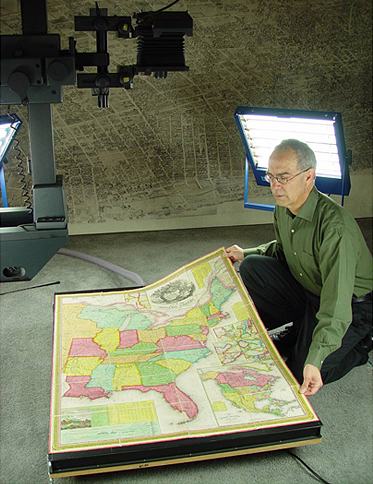
David Rumsey, whose map collection currently exceeds 150,000 pieces has never been a professional cartographer. He received a Yale degree and worked in real estate and finance for 20 years. Collecting was a hobby — he obtained the first historical maps of North and South Americas in the 1980s.
In 1996, he decided to make his collection available to the whole world and started digitizing the archive. It took him years. As of now, only half of the collection is published at Davidrumsey.com: 69,000 maps, infographics, engravings, and book covers in high resolution.
Rumsey now heads the company called Cartography Associates that develops programs for cataloging images on the web and Luna Imaging Inc. that created service products used in many libraries and research centers in the US.
In 2009, Rumsey handed his collection over to Stanford University. Since then, the whole archive is stored in the David Rumsey Map Center inside the main library of the university.
At the same time, Davidrumsey.com continues to work as an open resource, The archive’s catalogue is organized by categories, such as publisher or author of the image, publishing date, or depicted geographic location. Each of the images can be downloaded from the website in high resolution, and printed versions of the maps are available for purchase.
Bird In Flight infographic editor Darina Solodova spent three days studying Rumsey’s collection and chose the most interesting and unusual items from it.
A click on the image opens the collector’s website with the same image in the highest possible resolution.
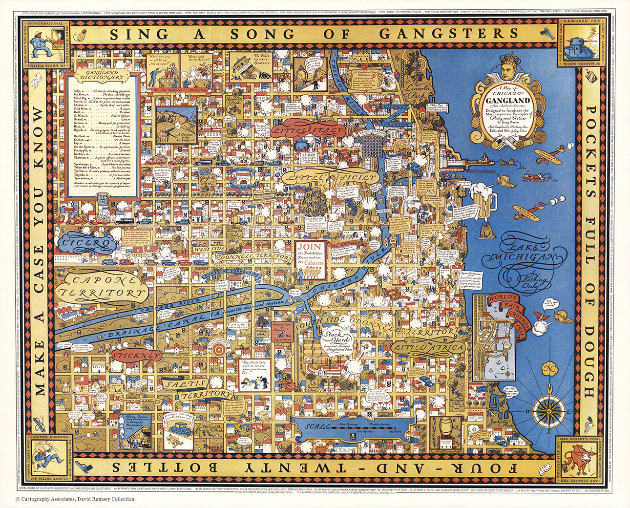
Chicago GanglandUSA, 1981
The map was originally published in 1931 in Chicago. Below is its reissued version from 50 years after. The map legend says it was “designed to inculcate the most important principles of piety and virtue in young persons and graphically portray the evils and sins of large cities.”
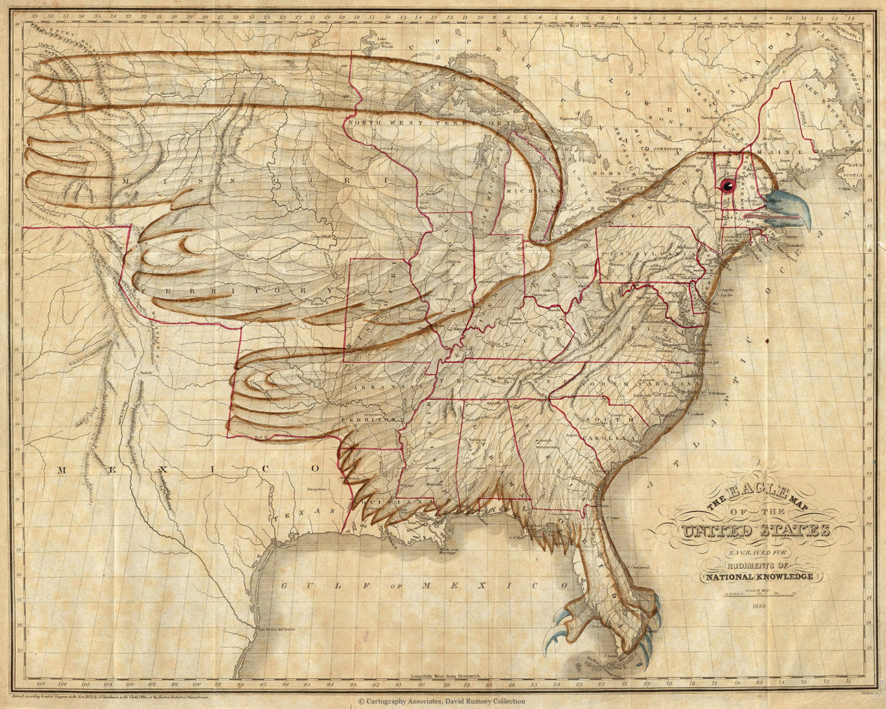
The Eagle Map of the United StatesUS, 1833
This map was published in Philadelphia in 1833 as part of the 400-page atlas called “Rudiments of National Knowledge, Presented To The Youth Of The United States, And To Enquiring Foreigners.”
To make a simple visualization of US geography, the author of the map, James Churchman, superimposed a simple and recognizable image of an eagle on it, with his talons in Florida, the eye in Vermont, and the wings spreading west to the Missouri Territory. Churchman chose the eagle, which has been the national emblem since 1782, for patriotic reasons (some of the states had separatist moods at the time). The contour of the bird did not entirely match the country borders — for instance, the author didn’t manage to fit in the state of Maine. In the atlas, Joseph Churchman, the author of the accompanying text, advised the citizens of the state not to take it personally and consider themselves “the cap of liberty, attached to the eagle’s head.”
The hope that the map would aid future generations of children when studying geography were not fulfilled — the borders of the country changed considerably in the next decade after it was published.
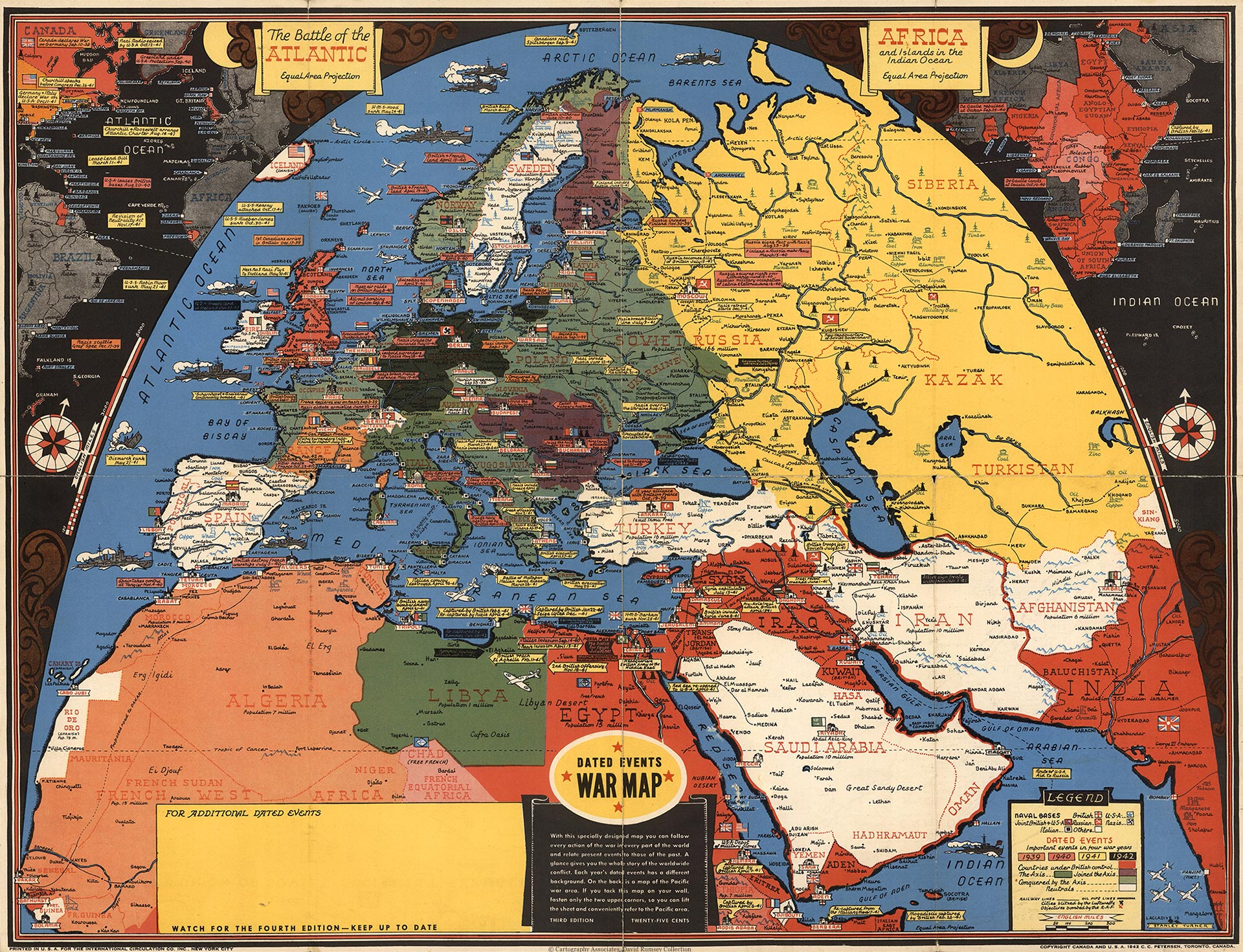
Map of WWII EventsCanada, 1942
Historian Susan Schulten says that the rapid unfolding of events during WWII and the popularization of aviation generated a high demand for maps in the US. The maps that explained why President Roosevelt was stationing troops in Iceland or sending the fleet to the Indian Ocean were particularly popular.
The map by Canadian artist Stanley Turner falls in this category: the author aspired to include all available information about the war theater in one image, so he managed to show not only geographical, but also chronological and even anthropological data. The map has naval bases, pre-war borders, the political status of countries, natural resources and the dates of main events of the war.
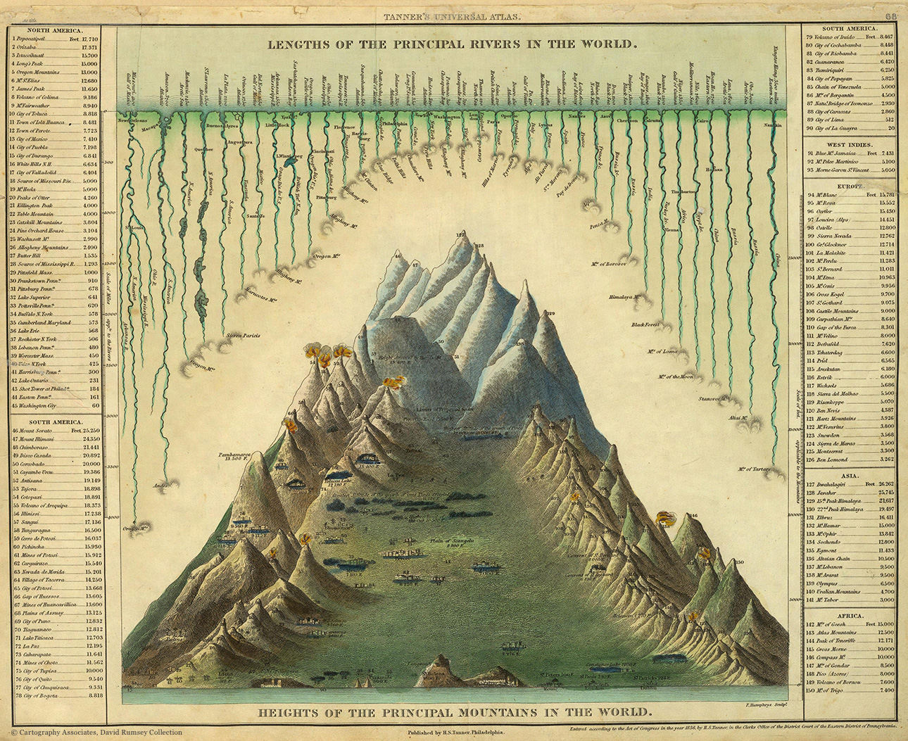
Map of the Highest Mountains in the WorldUS, 1836
The map was published in the first half of the 19th century in Philadelphia and introduces the longest rivers and the highest mountains of the world.
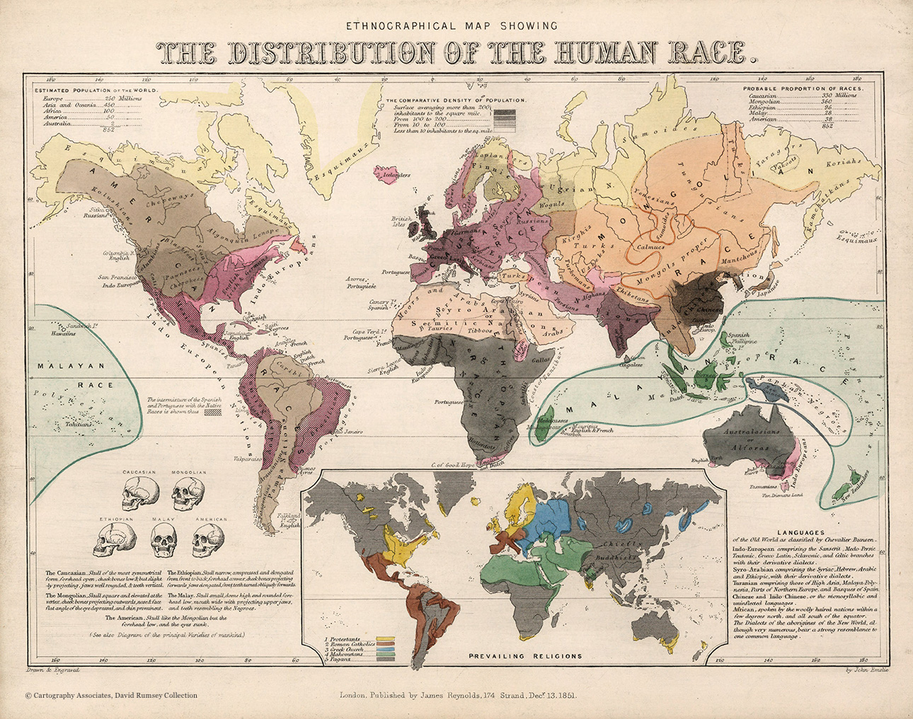
Map of the Distribution of the Human RaceGreat Britain, 1851
The map is hand-colored and shows the world’s population density, as well as the racial distribution convention at the time. The authors of the map used the classification by German scientist Johann Friedrich Blumenbach who divided humans into the following races: Caucasian (Europeans), Mongolian (Asians), African, American, and Malayan (Indonesians, Australians, and Polynesians). Blumenbach based his theory on craniological research which includes anthropometric measurements of the skull, that is why the map depicts and describes the skulls of all races.
The map also includes information about the distribution of world religions and languages.
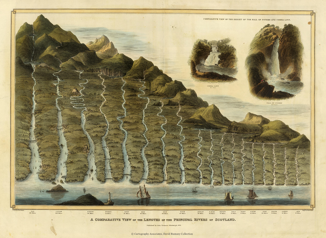
Length of the Rivers of ScotlandGreat Britain, 1832
The map was published as part of the atlas of Scotland. It shows the longest rivers in the country, as well as the comparison between waterfalls Foyers and Corra Linn.
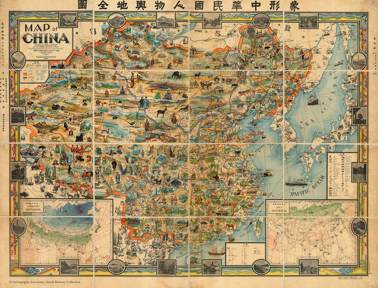
Map of ChinaChina, 1931
The map was created by Ivan (John) Diakoff of the former Russian Imperial Oriental Society who wanted to show the diversity of China that deeply impressed him. The legend consists of 34 symbols that mark temples, universities, museums, ports, factories, areas where silk and paper are produced. The depiction of terrain is relative, and all the names are given in English and Chinese. The Department of Education in Harbin approved the map for use in middle and high school.
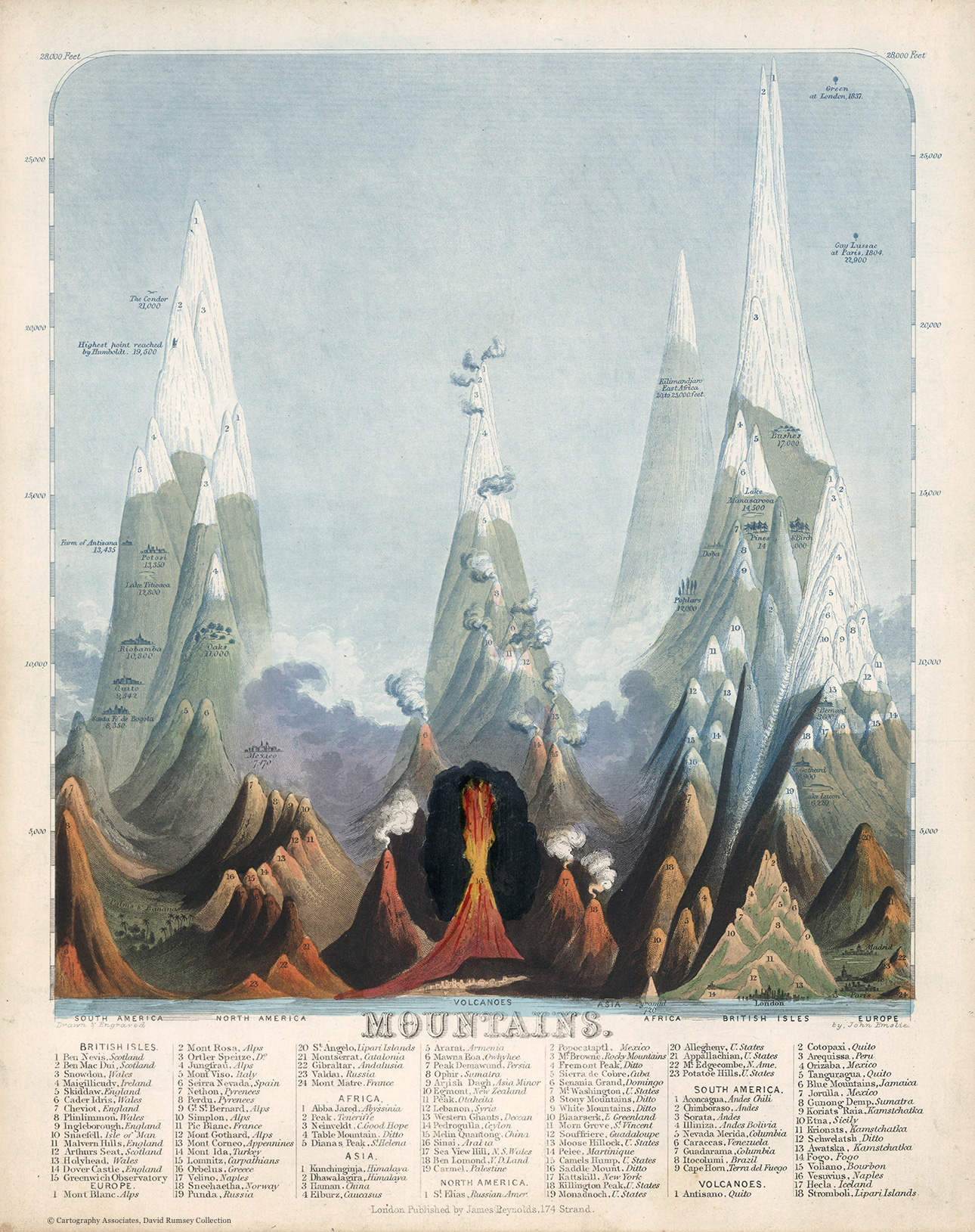
MountainsGreat Britain, 1851
Hand-colored infographic allows the readers to compare the height of mountains and volcanoes all over the world, including Ben Nevis, Snowdon, Skiddaw, Cader Idris, Etna, and Vesuvius.
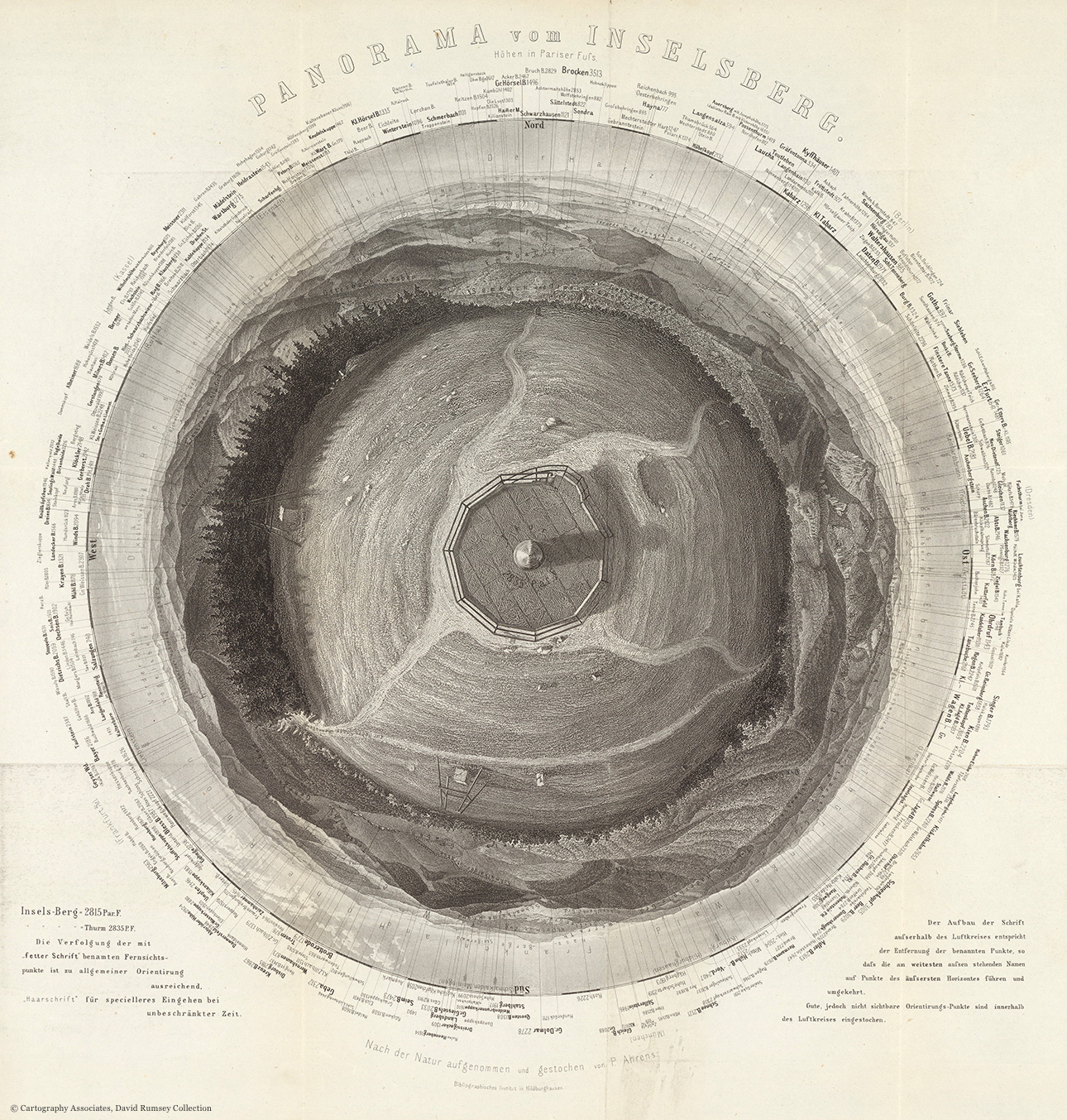
Panorama of InselsbergGermany, 1860
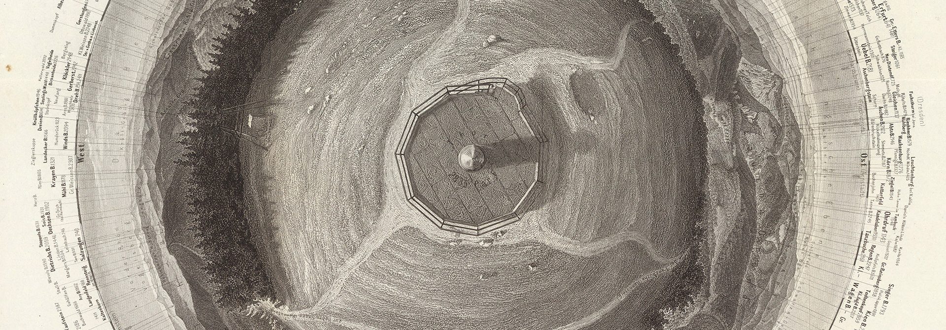
The map presents a 360-degree panorama from the tower on top of the mountain Grosse Inselsberg in Germany. It is one of the most scientifically accurate spherical panoramas of its time. It shows cities, mountains, and main landmarks, and the corresponding lines show the height of each of them. The map was published by the German Bibliographische Institut.
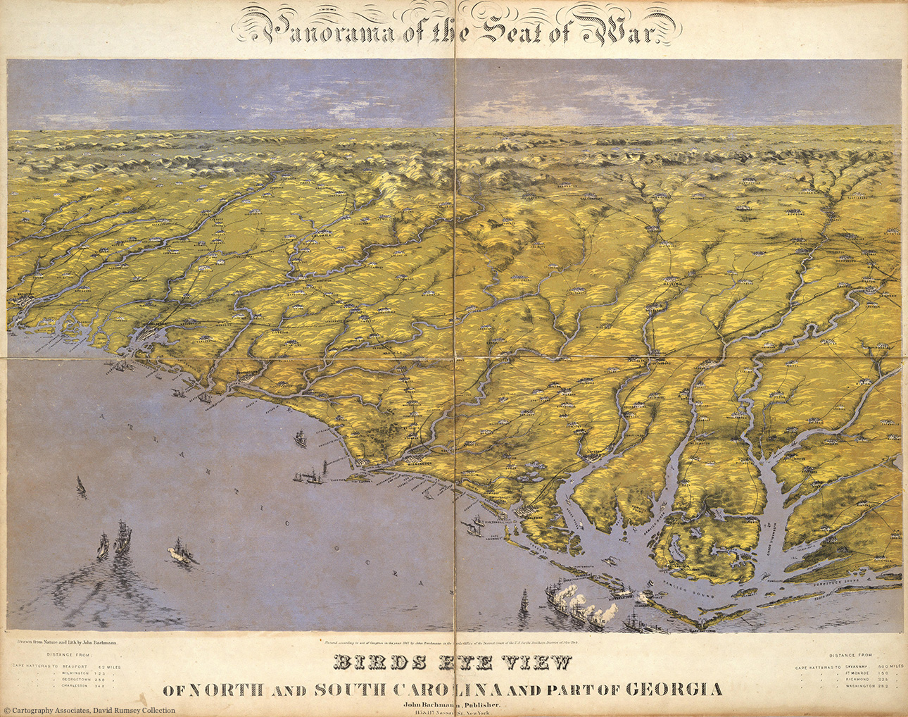
Battlefields of the Civil WarUS, 1861
In July 1861, famous lithographer John Bachmann published a panorama of three maps which allows readers to grasp the general view of the eastern battle theater of the American Civil War. The wide-angle map shows the front from an unusual perspective, marks ships, railroads and the locations of the major battles.
One of the three maps of the panorama — the map of North and South Carolina and a part of Georgia.
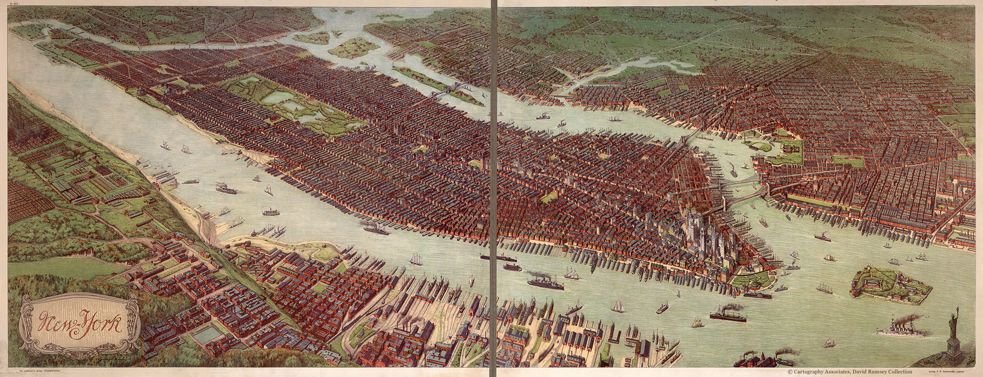
New York CityGermany, 1908
This aerial view of New York City was drawn by Josef Klemm — artist, lithographer, and image restorer, whose works are known primarily for their high level of detalization. The exact date the map was published is unknown, but the year could be identified, as it shows the Singer Building built in 1908, but not the MetLife Tower built in 1909.
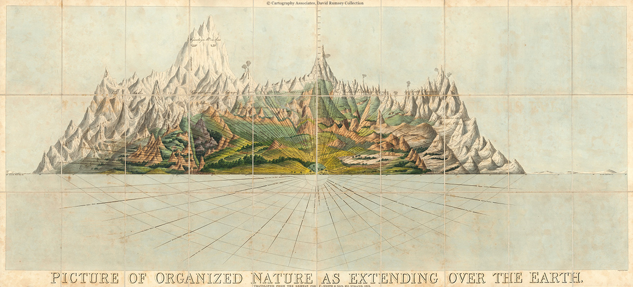
Organized NatureGreat Britain, 1828
Charles Smith’ diagram that was published in the first half of the 19th century in London allows readers to compare the mountains by height and richness of flora and fauna. The central axis of the map has marks for the height between 0 and 27 thousand feet above sea level, there is also a snowline. The diagram was included in the book called “Picture of Organized Nature as Extending Over the Earth”, translated from German into English in 1828.
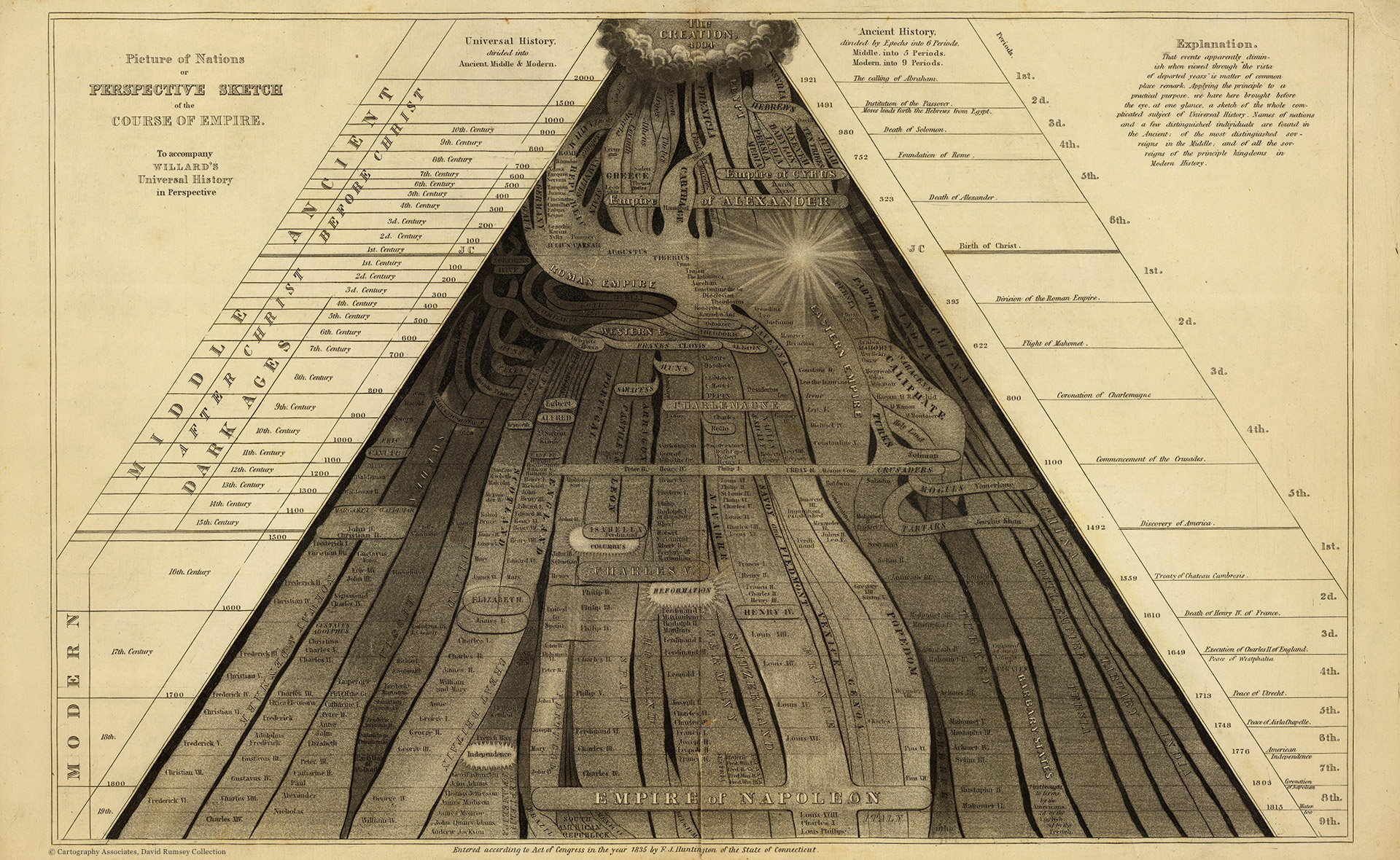
Map of NationsUS, 1836
Emma Willard’s infographic published in the first half of the 19th century in Hartford depicts the development of empires in chronological order. The infographic was encompassed in the textbook on universal history.
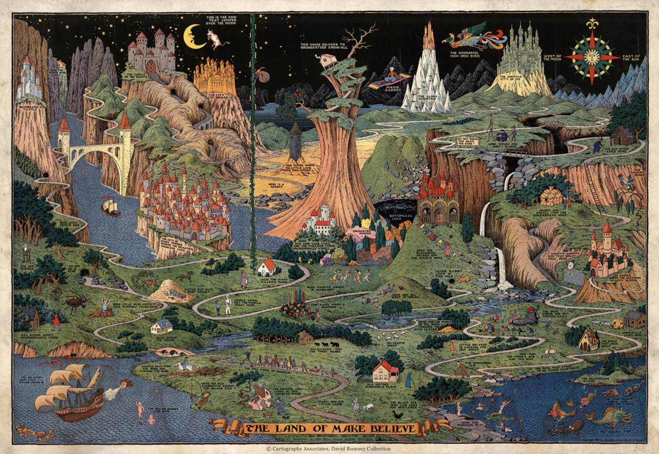
Map of Fairy-Tale CharactersUS, 1930
The picturesque and surprisingly detailed map that shows more than fifty classic fairy-tale characters. Jaro Hess, the author of the map, was born in Czechoslovakia and moved to the US in 1920s. He worked as a landscape designer and gardener, but got famous mainly for his artistic projects.
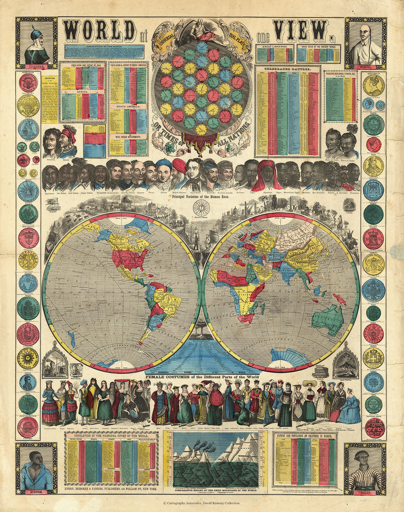
World at One ViewUS, 1854
Each new version of this map published by Ensign, Bridgman & Fanning in New York City became bigger and bigger — the 1854 edition is almost twice as big as 1852. The map design is typical for the mid-19th century.
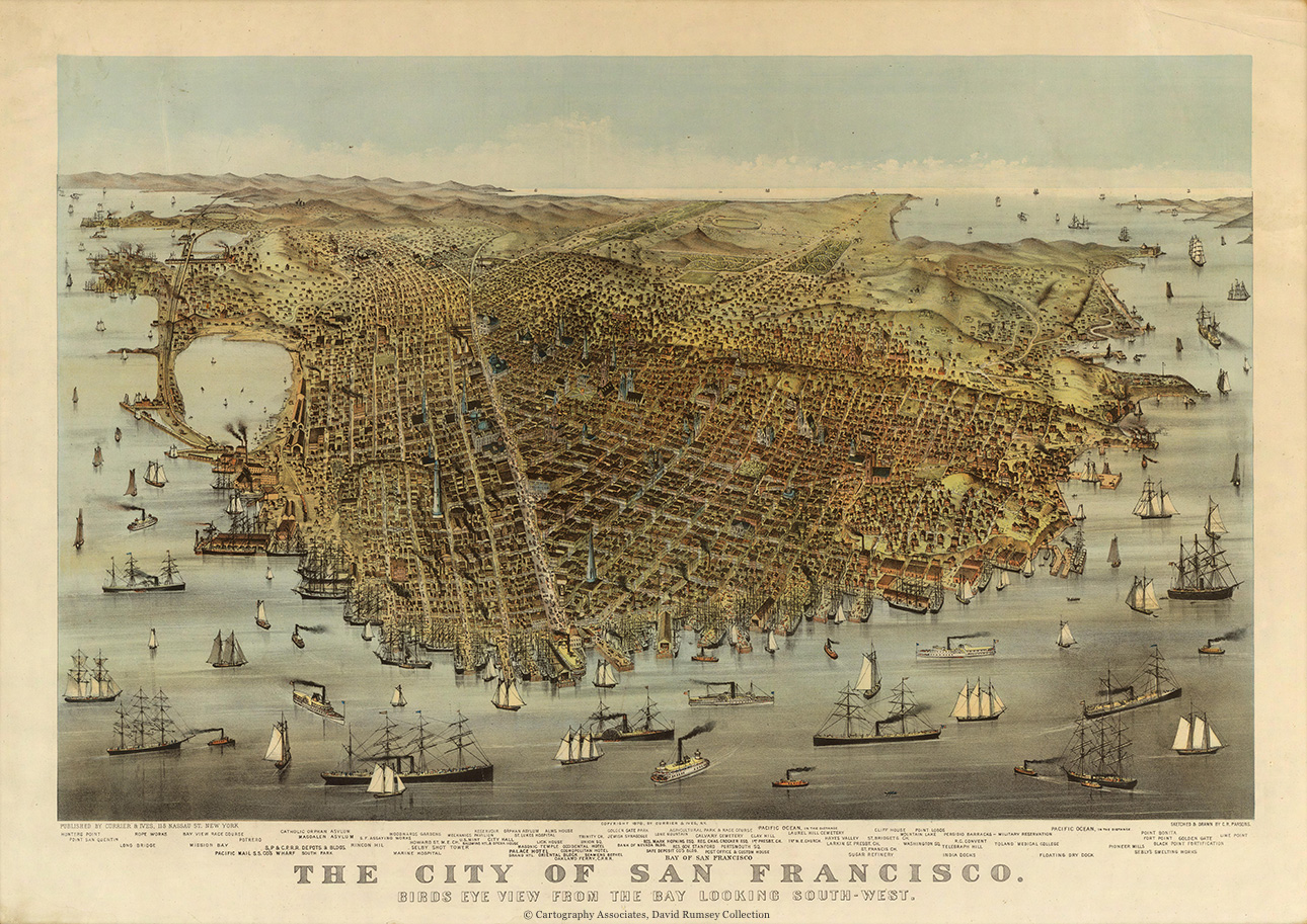
Bird’s Eye View on San FranciscoUS, 1878
The map published in the second half of the 19th century in New York City shows San Francisco from a bird’s eye view (view from the bay).
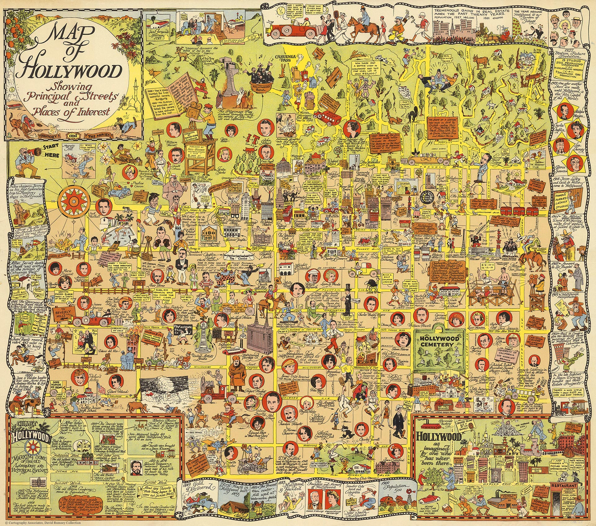
Map of HollywoodUS, 1928
Godwin Harrison’s eccentric map depicts the main streets and places of interest in Hollywood. The author drew a separate map of Hollywood as imagined by those who have never been there. Along the edges of the map there are some historical plots.
