Infographic of the Day: The Structure of World Trade
According to the estimations of the UN, in 2015 the global trade volume was about $15.6 trillion. Metrocosm shows the distribution of this money between the countries.
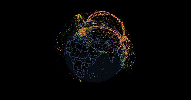
The authors of Metrocosm, a website which shows visualization of data, released an interactive infographic where they showed the main spheres of import and export in different countries. According to them, they used information from UN reports when working on this project.
The visualization looks like a 3D model of Earth: the dots on it represent main trade flows, their color depending on the type of goods. For instance, purple stands for clothing and accessories, red for transportation, and grey for wood.
Max Galka, one of the authors of the infographic, says that his work, among other things, shows that the world trade is dominated by three countries — US, China, and Germany. Over 50% of goods pass through them.