Infographic of the Day: The Supposed Day of Your Death
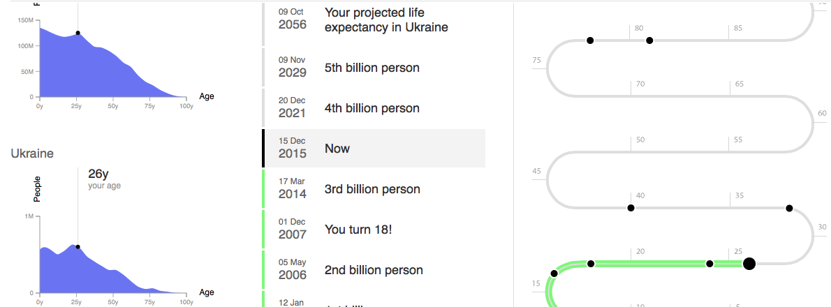
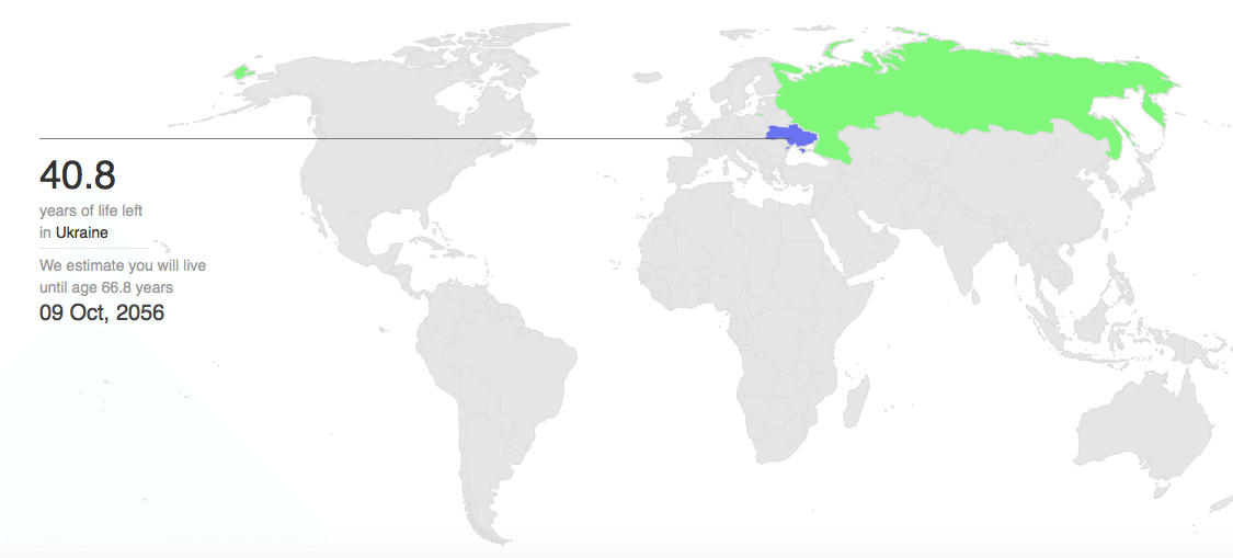
Population.io calculates your life span based on your country and date of birth.

German designer Benedikt Gross and the World Bank economist Wolfgang Fengler developed a website Population.io, which shows you where you are compared to the population of the planet.
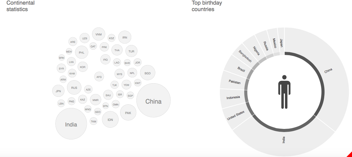
The user chooses their sex, country country and date of birth, after that they see a series of interactive charts and graphs, which show, for instance, the percentage of the people on the plant, who are older then them, the number of people, who were born on the same day, and even the suggested day of their death.
Population.io uses official demographic data and reports, published by the UN.
Cover photo: Depositphotos