Kantar Selected the Most Beautiful Data Visualizations
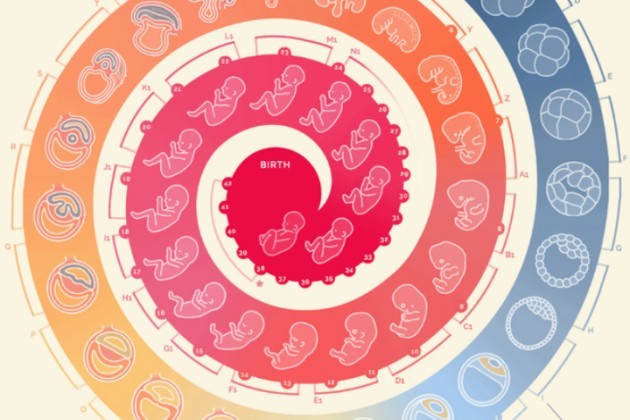
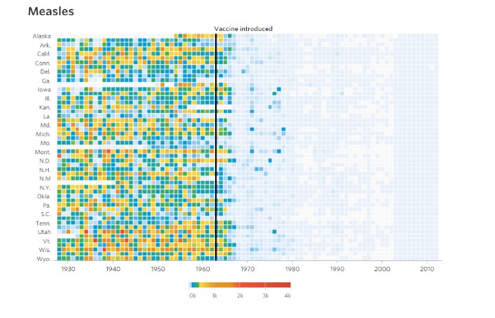
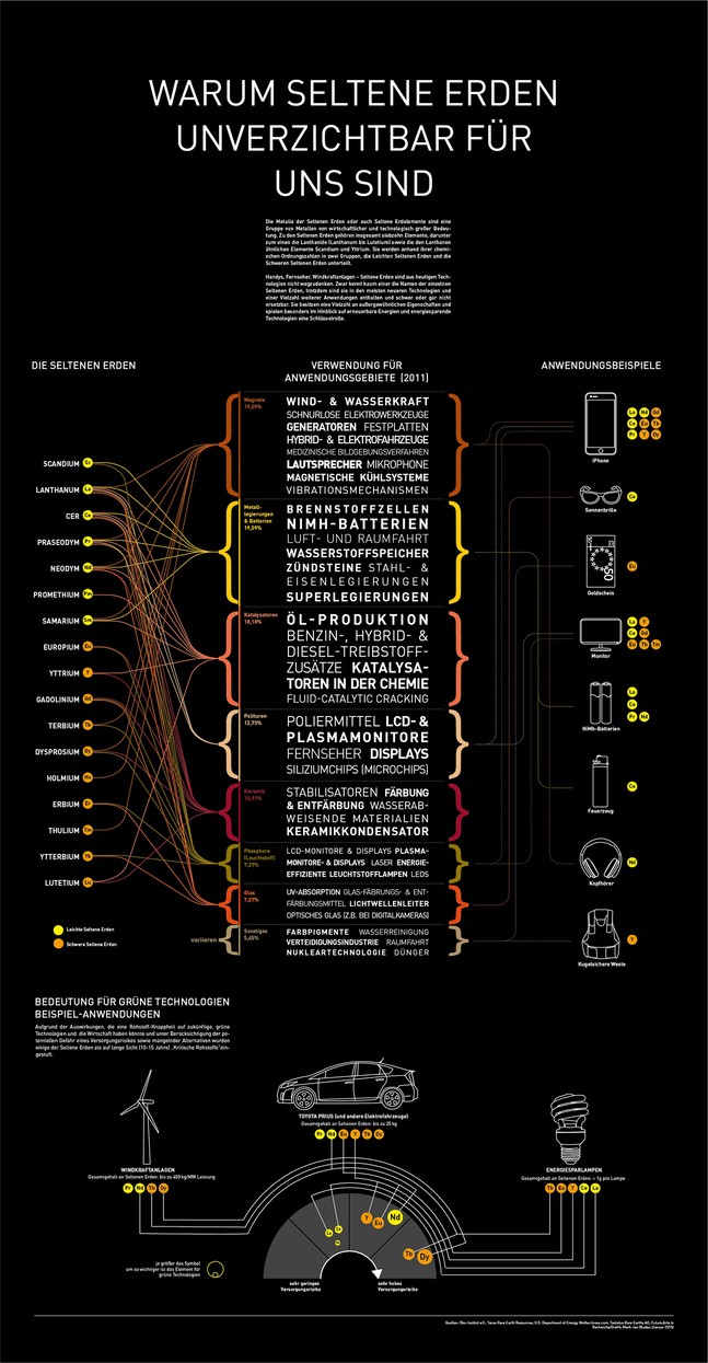
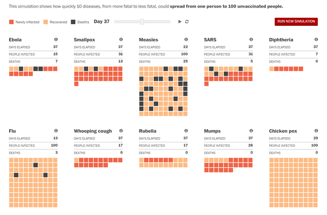
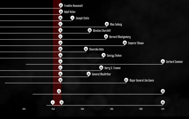
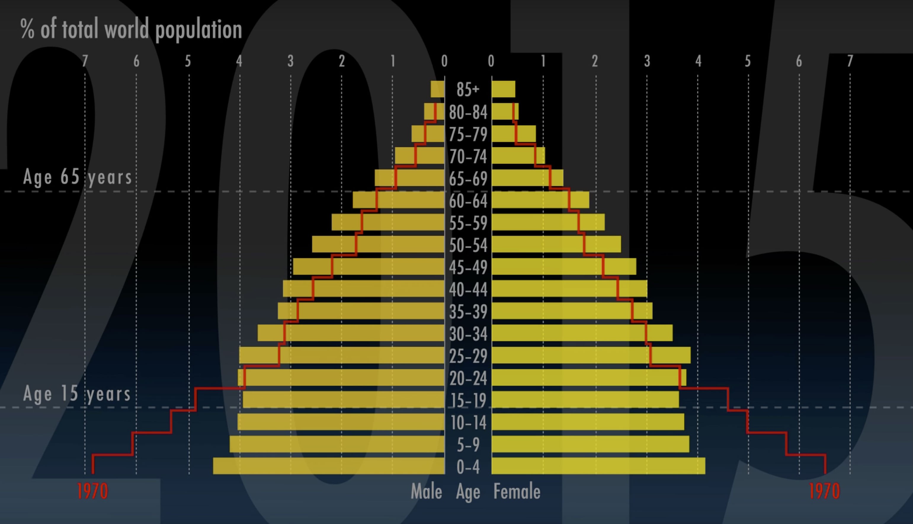
In early December the jury of Information Is Beautiful Awards, a contest set up by Kantar research company, announced the finalists of 2015. The jury names the winners in 17 categories, among them: Data Visualization, Infographic, Interactive, Data Journalism and the others.
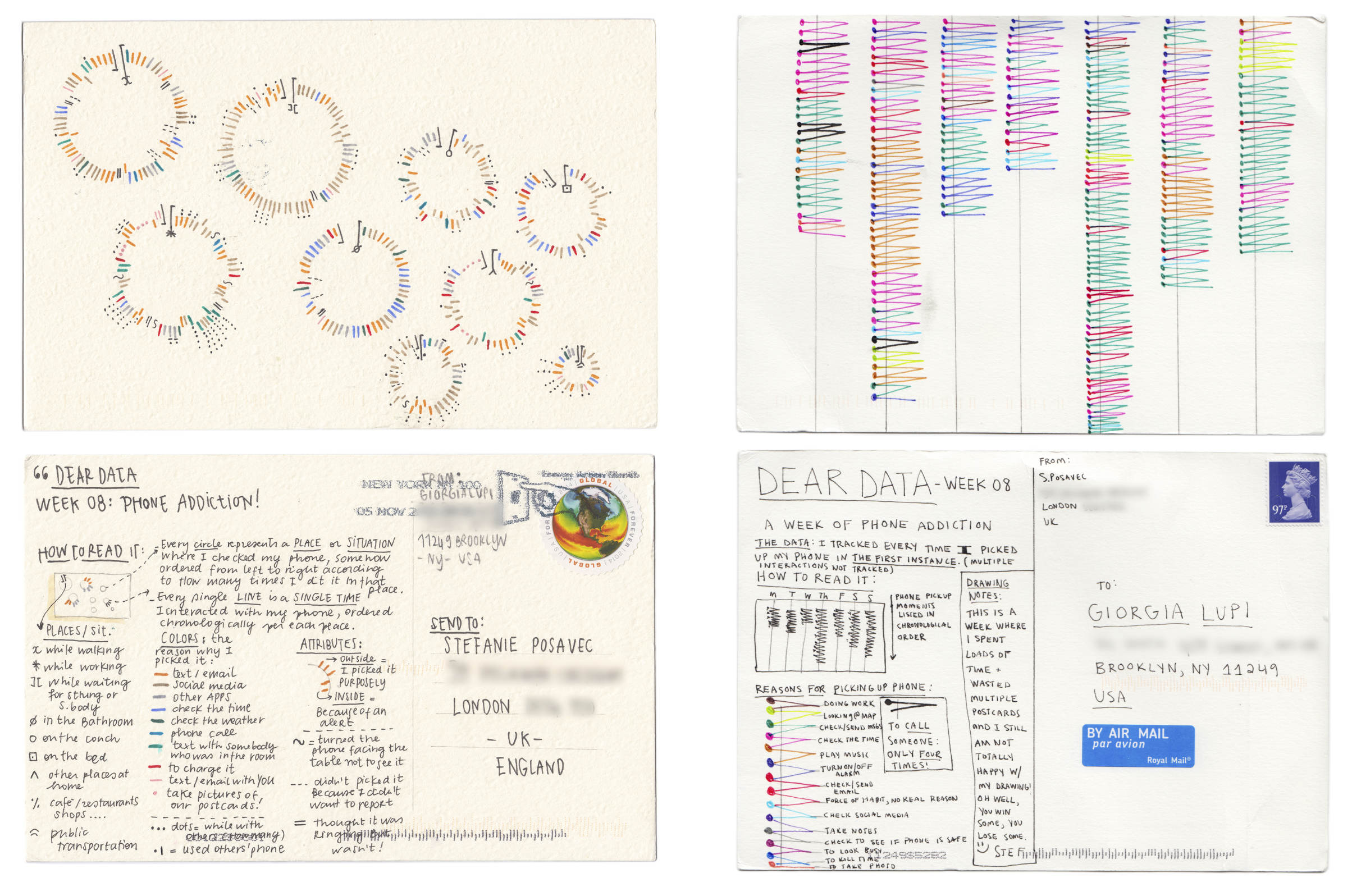
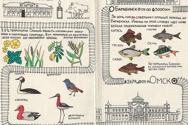
The project Dear Data by designers Giorgia Lupi and Stefanie Posavec won in the category Data Visualization Project. In 2014 two young women, separated by the ocean between them, decided to exchange handmade cards illustrating their lives once a week. Each card had a new theme. One week they were writing down all compliments they heard from people, another — all their wishes, the next one they talked about people they have met. Then they turned the information they collected into schemes and sent them as postcards.
Information Is Beautiful Awards was established in 2012 by a journalist David McCandless and the company’s Creative Director Aziz Cami, to popularize the art of data visualization.
