Dystopia on Their Mind and Utopia in Their Heart:
Interview with the Designers of the Kyiv Biennial

Amsterdam-based graphic design studio founded in 1997 by Marieke Stolk, Erwin Brinkers, and Danny van den Dungen. In 20 years, EJ have worked on projects for a wide variety of institutes, including Stedelijk Museum Amsterdam, Centre Pompidou, Dutch Post Group, and Whitney Museum of American Art. Work by EJ has been collected by the Museum of Modern Art (New York), Stedelijk Museum (Amsterdam), SFMOMA (San Francisco), Art Institute of Chicago (Chicago) and other institutes.
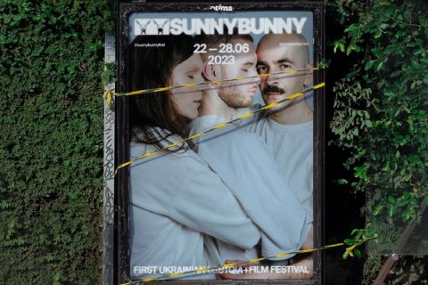
On October 20, the international art forum The Kyiv International — Kyiv Biennial 2017 started in Kyiv. The main goal of the event is to find a collective answer to the key questions of our modern times. According to the organizers of the biennial, exhibitions and performances that are included in the project offer the audience an alternative view on the world’s problems — through art.
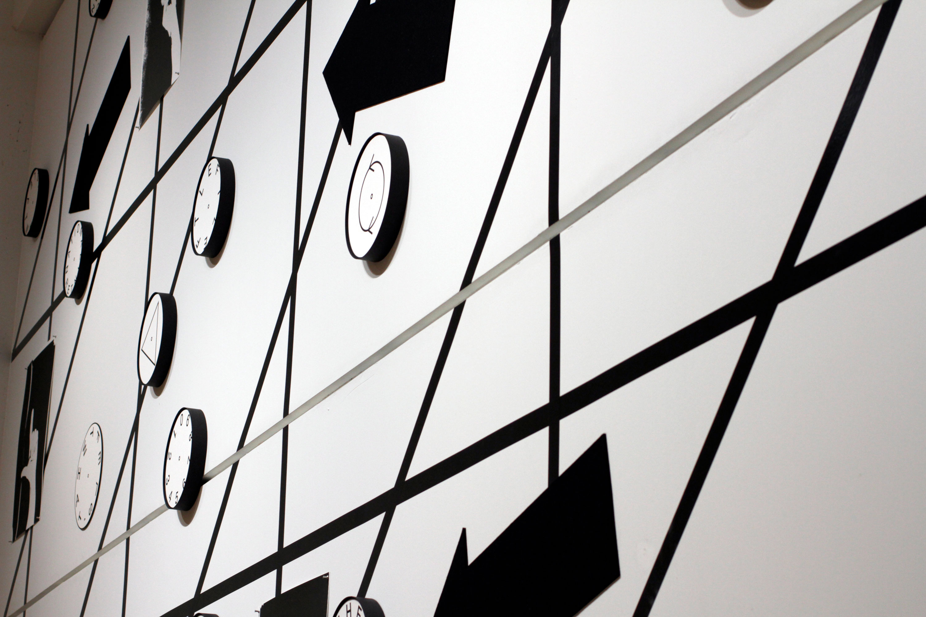
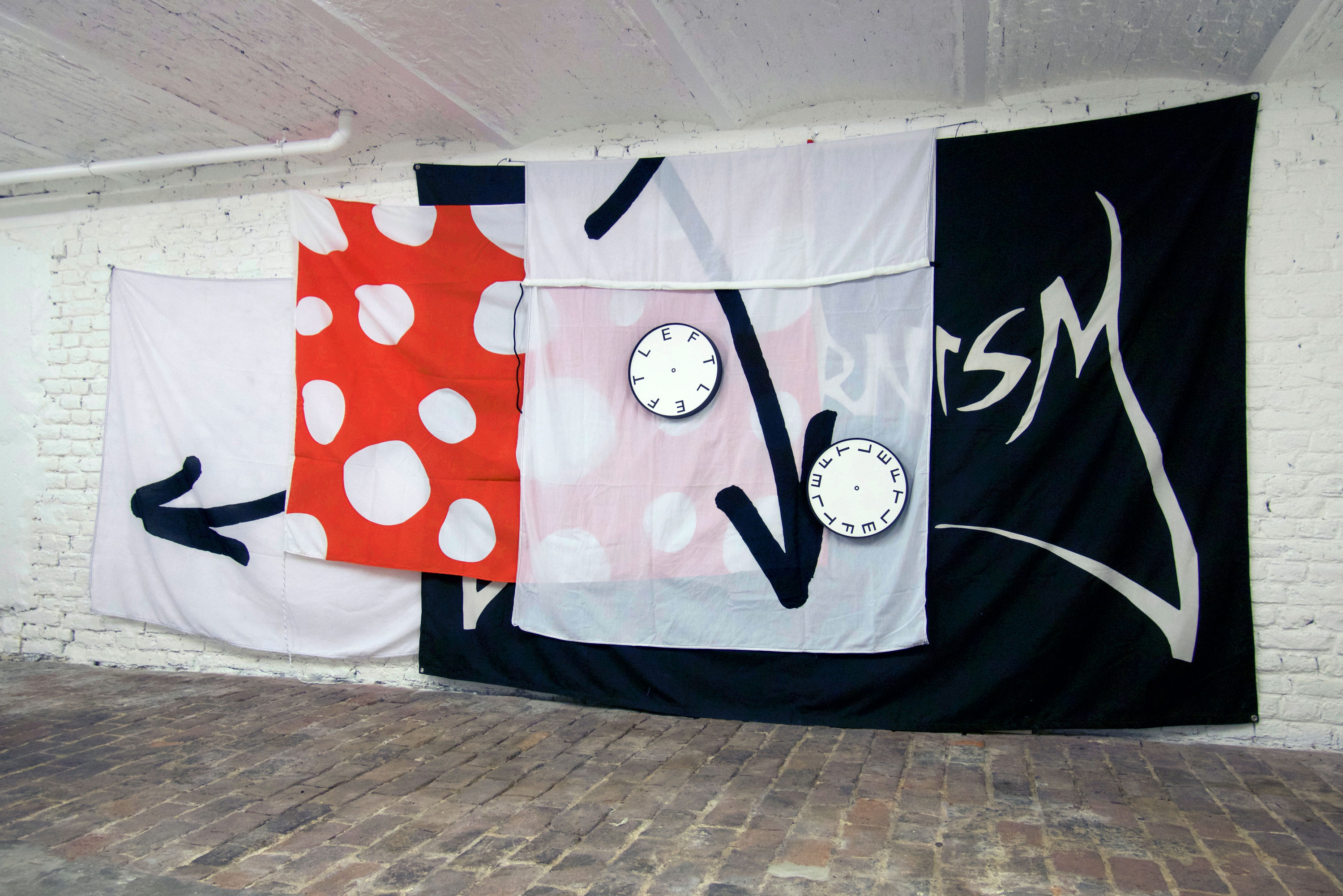
Part of the installation ‘(What’s) Left of the International?’ Museum für Gestaltung, Zürich, Experimental Jetset, 2015.
How did you find out about The Kyiv International — Kyiv Biennial 2017?
In 2016, we had a solo-exhibition (‘Provo Station: Models for a Provotarian City’) at the Galerie für Zeitgenössische Kunst (GfZK) in Leipzig (Germany). One of the persons involved in the production of this project was Katia Mischenko, a curator from Kyiv. She told us all about ‘The School of Kyiv’, the 2015 edition of the biennial. She also gave us the accompanying catalogue (‘The Book of Kyiv’), which we thought was an extremely interesting (and very well-designed) publication — reading it was a great introduction to the modernist heritage of Kyiv. So when we were asked later if we wanted to be involved in the 2017 edition of the biennial, we simply couldn’t refuse.
What have you focused on when creating the biennial’s graphic identity?
Vasyl Cherepanyn, one of the organizers and program director of Kyiv Biennial, told us he was really intrigued by a site-specific, temporary installation we created in 2015, for the Museum für Gestaltung in Zürich (Switzerland). Titled ‘(What’s) Left of the International?’, this wall piece included a series of cardboard, clock-like discs — clock-faces, in which the numbers were replaced with abstract symbols, and letters repeating the title of the installation in everchanging compositions.
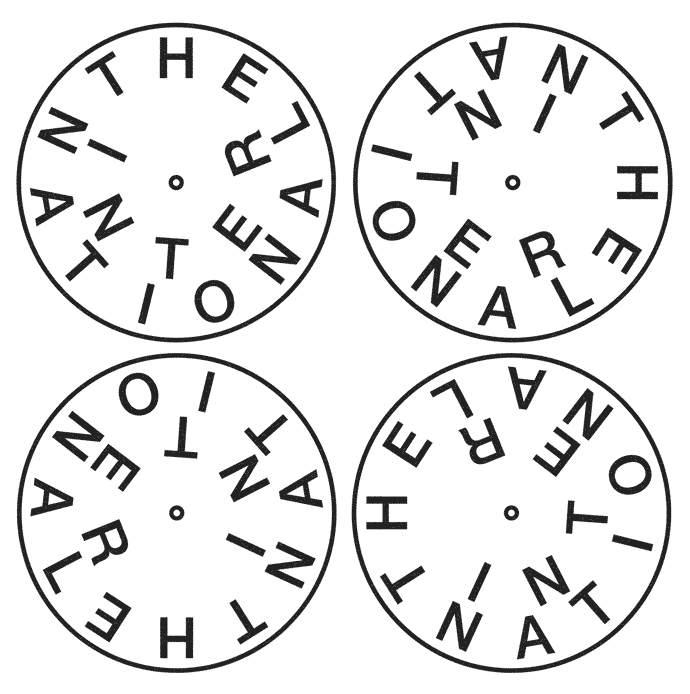
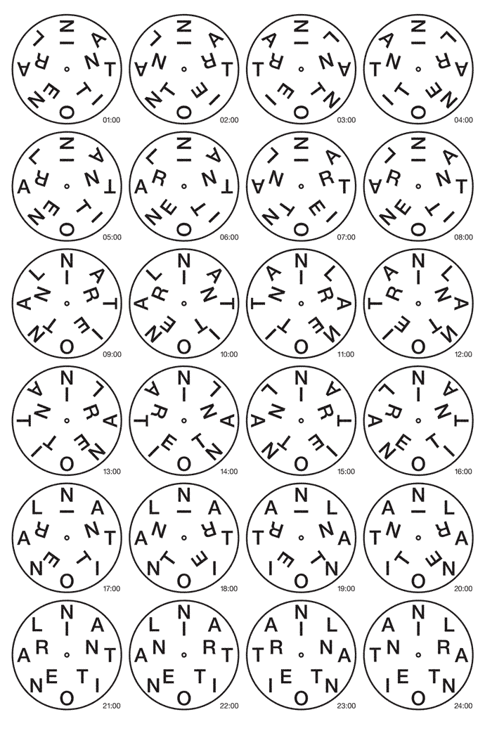
When we were asked to contribute a work to biennial, it seemed only logical to return to these clock-faces. And thus, we created (or better said, re-created) a simple, clock-like emblem with a dial that spells ’T-H-E I-N-T-E-R-N-A-T-I-O-N-A-L’, meant to be used (in several rotating positions throughout all printed matter of the biennial, and thus, all throughout the city of Kyiv. So it’s basically an emblem, to be used as a seal or a stamp. We see it as a laconic, minimal intervention in the graphic language of the event. However, it is our intention to be more involved next year, during the second phase of the biennial.
Which background inspired you to create this visual concept?
Clocks and internationalism seem inextricably linked. From the decimal dials of French Revolutionary Time, to Tatlin’s ‘Monument to the Third International’, which was actually meant to function as a giant clock, its architectural elements rotating at different speeds, there seems to be a correlation between the mechanical movements on the inside the clock, and the cultural movements on the outside. Somehow, it made perfect sense to make that connection — between the motion of the clock, and the notion of ‘The International’.
From your work, it seems that you have been influenced by the modernist movement and its aesthetics. Why is this particular style so familiar to you?
We personally wouldn’t describe modernism as a style — we see it more as a mentality, or an attitude, or a language — or maybe a multitude of languages. When we think of modernism, we think of this whole maelstrom of opposing, clashing voices — from De Stijl to Futurism, from Bauhaus to Surrealism, from Constructivism to Dada, etc.
Modernism is this ever-spinning whirlpool driving us forward, right through history, from the invention of the printing press until now. What especially attracts us to the concept of modernism is the notion of materiality — the idea that we are ultimately shaped by our material surroundings, and that we can (in return) shape those material surroundings ourselves. We think that’s actually a very hopeful vision — the idea that we are living in an environment that is made by humans, and thus can also be changed (or unmade) by humans.
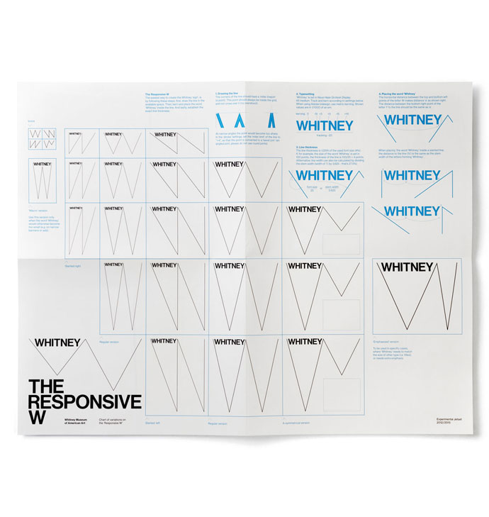
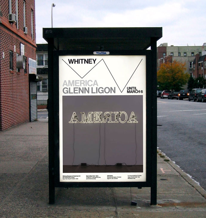
The graphic identity we created in 2012 for the Whitney Museum is a good example of this — it features a zigzag-shaped line (the so-called ‘Responsive W’) reacting to the proportions of the given space, thereby emphasizing the material dimensions of the printed object. We see this zigzag as a gesture that is both constructive and deconstructive — showing an image, while also making people aware that they are ‘just’ looking at a piece of printed matter.
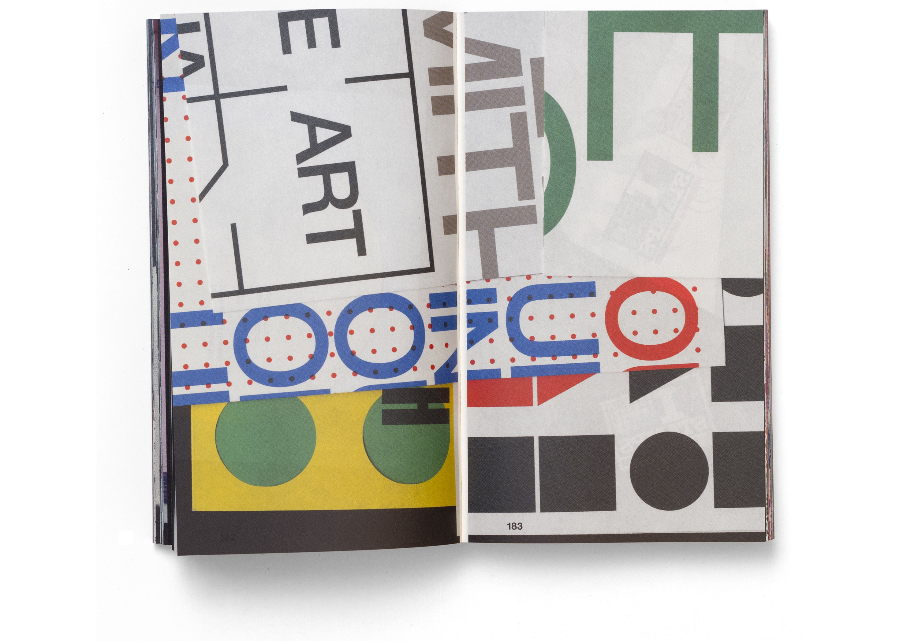
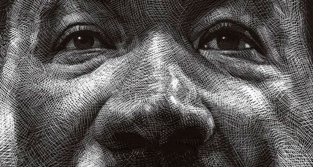
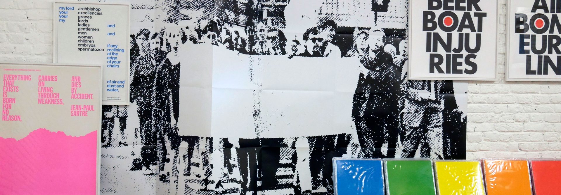
Detail of a monograph ‘Statement and Counter-Statement. Roma Publications, Amsterdam, 2015.
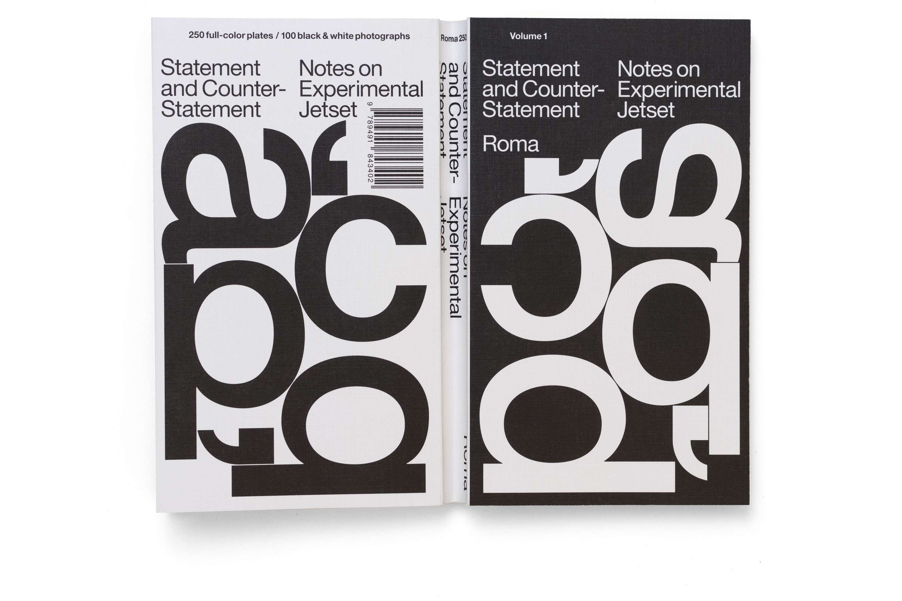
Detail of a monograph ‘Statement and Counter-Statement. Roma Publications, Amsterdam, 2015.
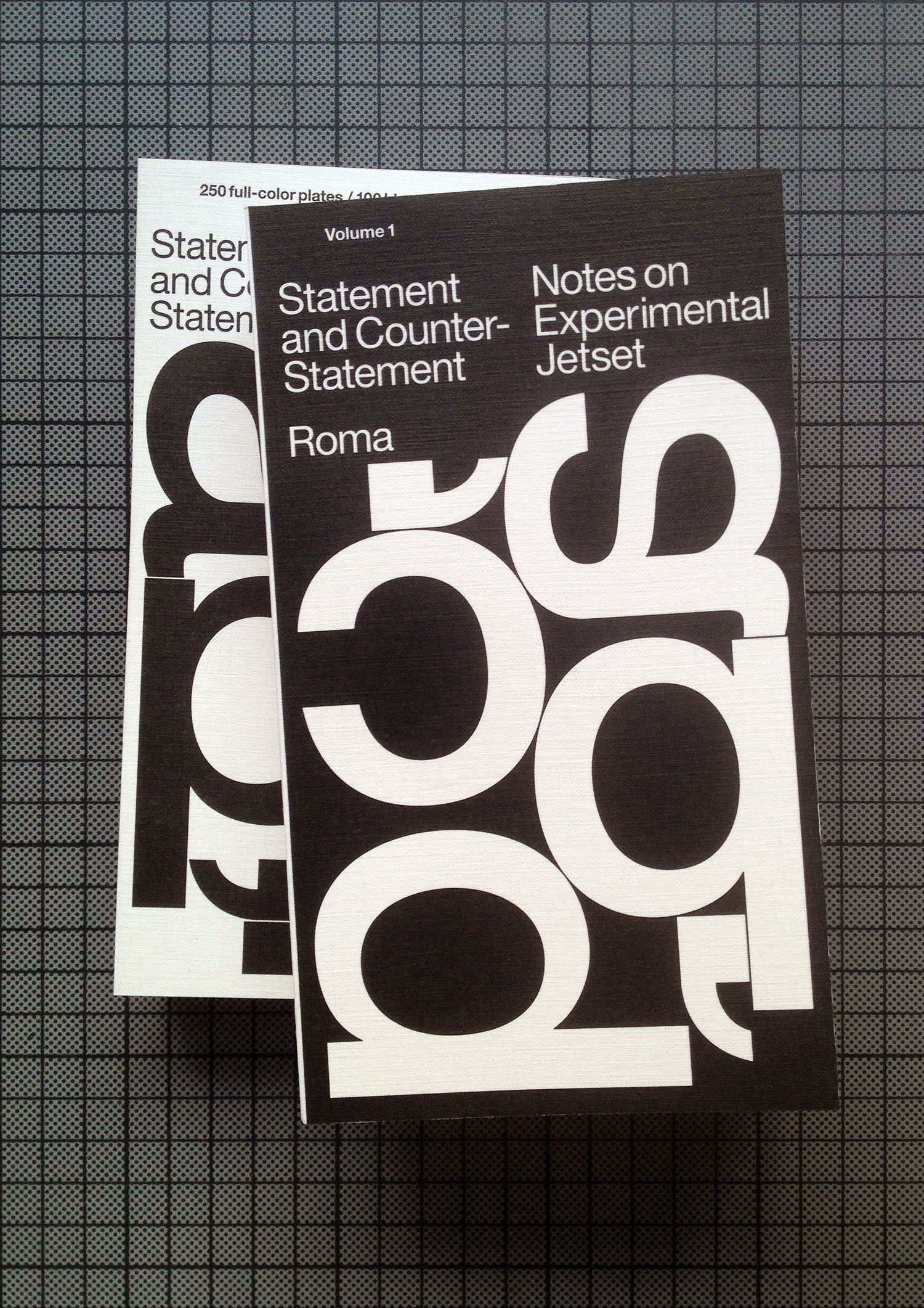
Detail of a monograph ‘Statement and Counter-Statement. Roma Publications, Amsterdam, 2015.
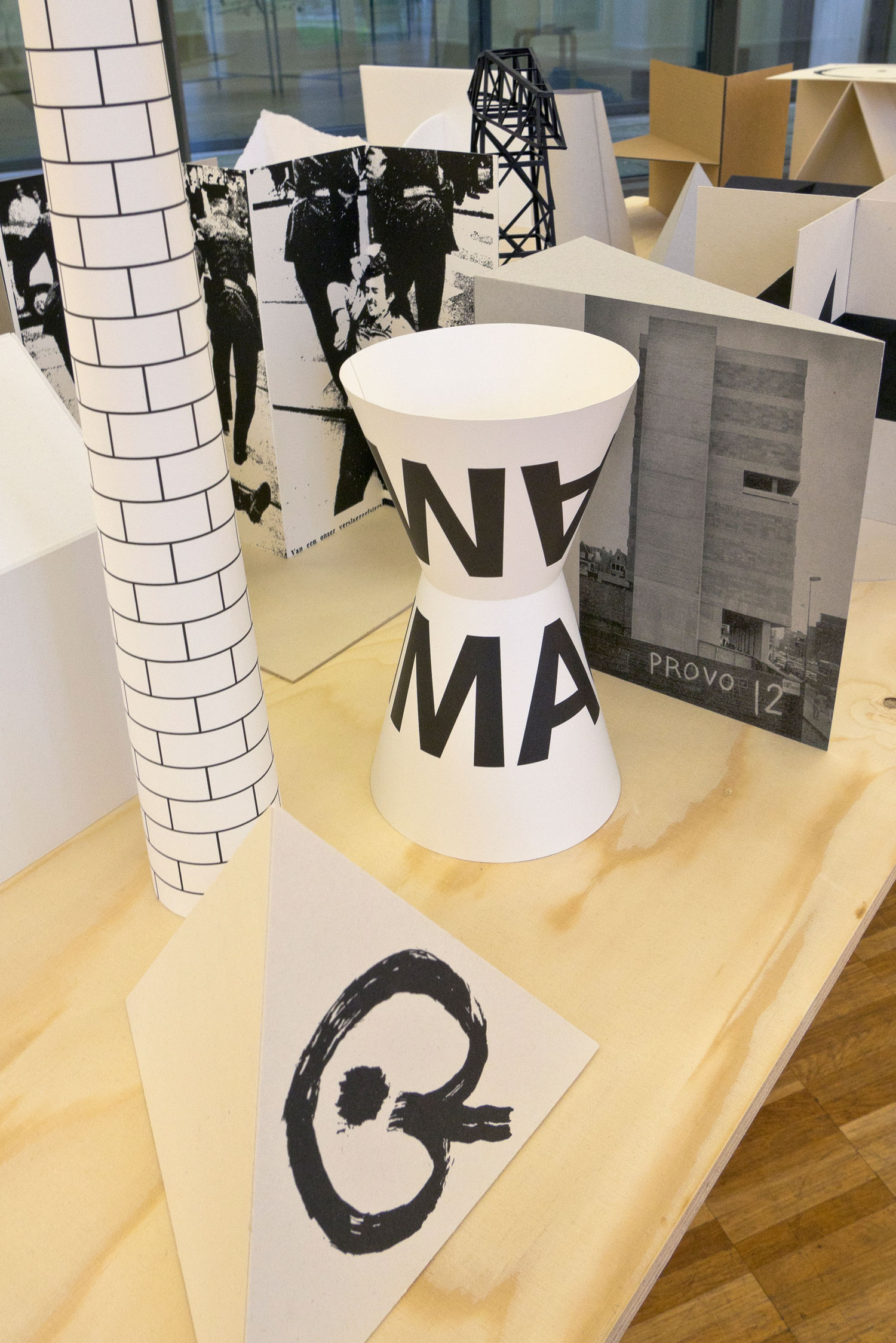
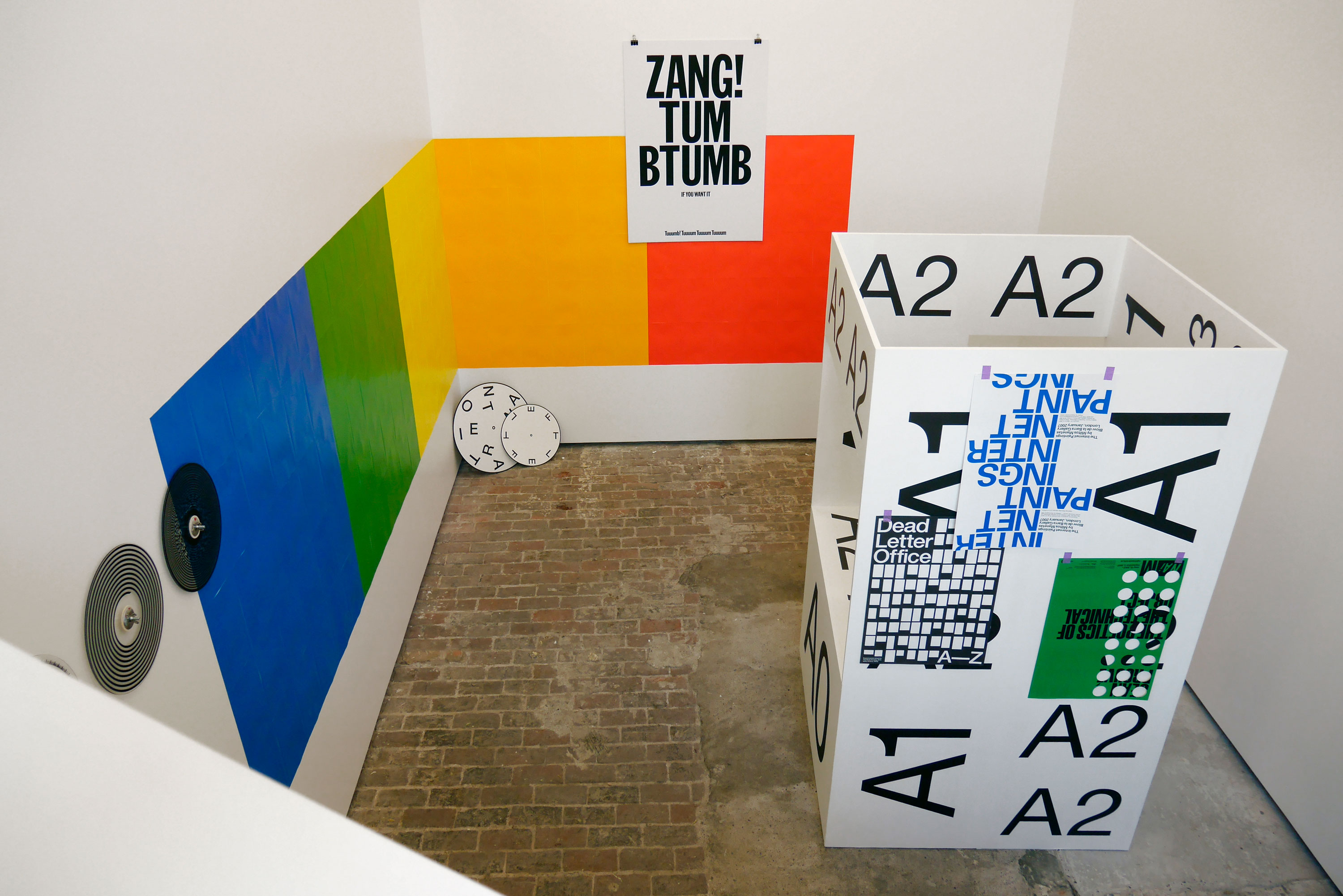
Installation ‘Models for a Provotarian City’. Solo-exhibition at GfZK, Leipzig, 2016.
The dynamics of destruction today is a big issue for Europe — Brexit, Catalian referendum, the mood in Scotland, the annexation of Crimea. Is graphic design ready to answer to such challenges and change under their influence?
In a way, you could argue that the very discipline of graphic design was born out of an era of great conflict and destruction. The modern notion of graphic design sprung from movements such as De Stijl, Bauhaus, and Constructivism — groups of artists and designers who somehow managed to develop new aesthetic languages while barely surviving in the midst of grotesque wars, great revolutions, grave disasters, and times of deep crisis.
So, modern graphic design grew directly out of these troubled times, almost as a way to dream about better times.
Of course, when the situation in Europe somewhat stabilized, the goals of graphic design changed as well. Graphic design became more stabilized, solidified, unified, pacified — after World War II, the ambitions of graphic design aligned first with post-war Social-Democracy, and then with the upcoming Anglo-Saxon ideology of neoliberalism. It was inevitable that graphic design went along with these changes — in the end, art and culture can only follow these larger, underlying economic developments. What makes graphic design so interesting — its ability to work within the existing power structures, perhaps even being complicit with it, while still envisioning a way out of it. Or, to speak with the Situationists: to live within the spectacle, but also against it.
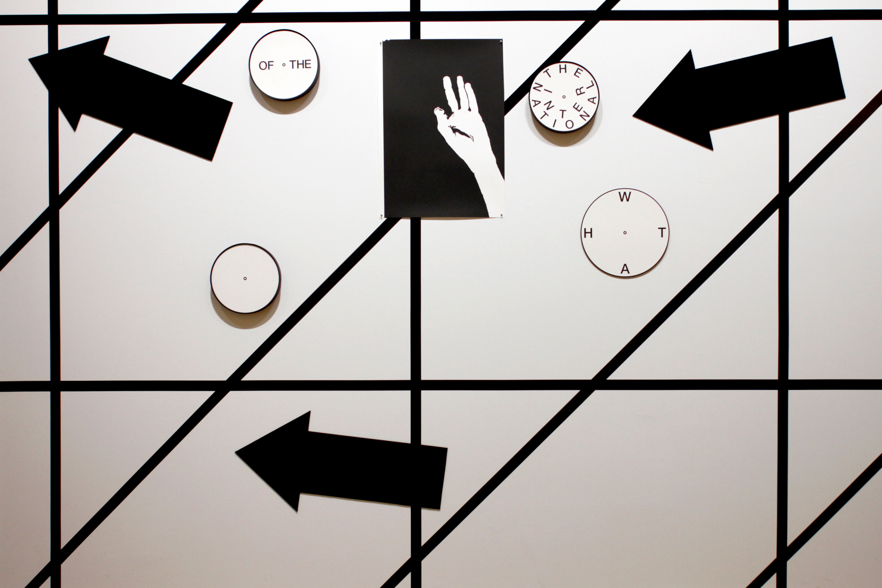
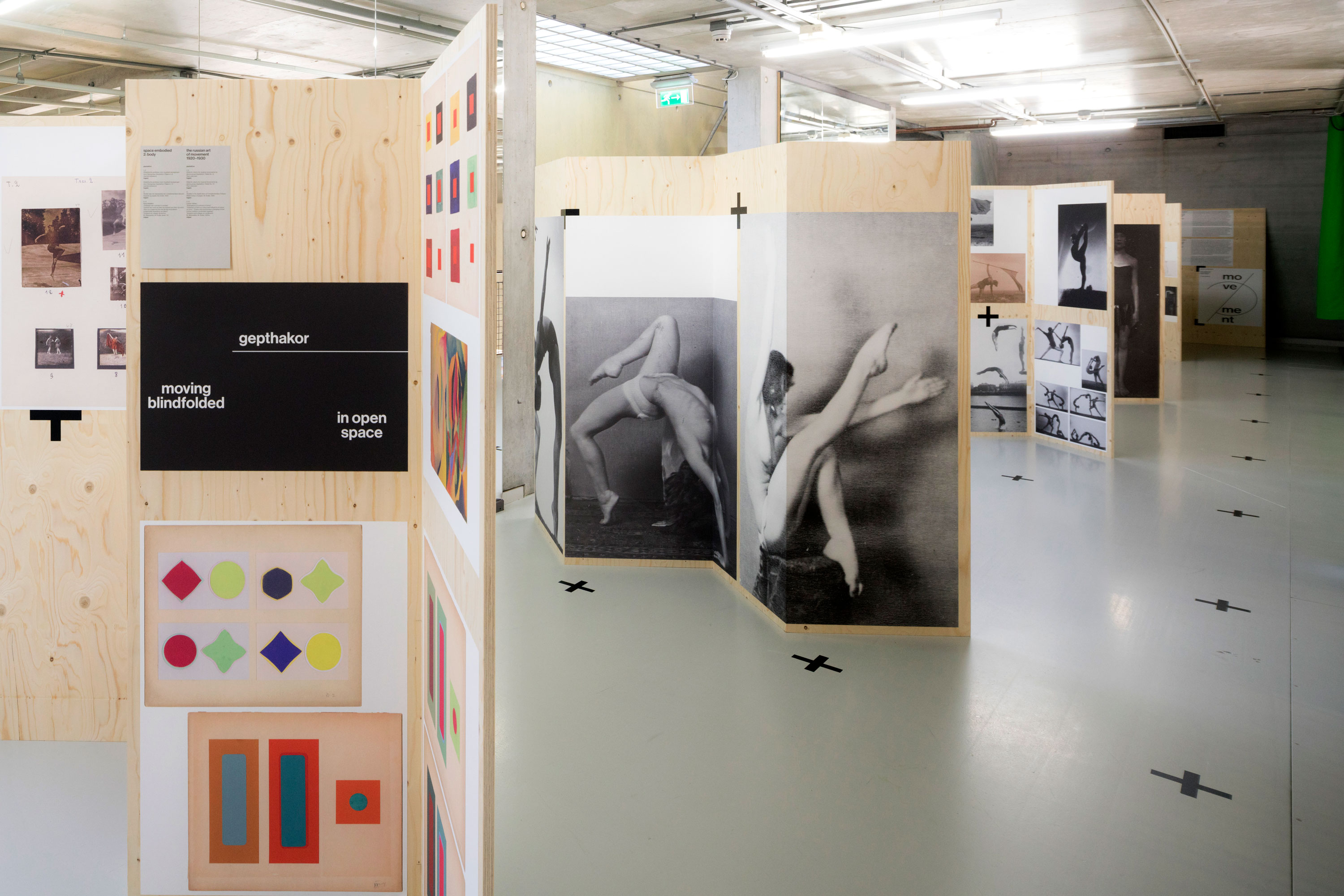
Detail of installation (What’s) Left of the International?’. Site-specific installation at Museum für Gestaltung, Zürich, 2015.
You have influenced a generation of younger designers. And who had a major influence on you?
In the ’70s, when we were very young kids, we were surrounded by the language of social-democracy — the modernist structuralism of graphic designers like Wim Crouwel, Jurriaan Schrofer, Ben Bos, etc. Everything around us (the stamps, the school books, etc.) was steeped in this particular visual language — and as a result, we feel that this language is now our mother tongue, our folk art.
In the ’80s, as teenagers, we got really interested in post-punk movements. We were simply too young to consciously participate in the original punk explosion of 1977, but we were interested in everything that came right after punk (mod, psychobilly, new wave, hardcore punk, two tone, etc.) – and all these subcultures had a huge impact on us.
In the ’90s, we were in our twenties, and we went to art school – right at the moment when grunge hit, and that whole ‘Generation X’-vibe was happening. Obviously, this whole era had an influence on us as well — we didn’t name our studio after a Sonic Youth album for nothing. And then the turn of the millennium took place, we all turned 30, we moved into our first real studio space, and Experimental Jetset took shape.
To make a long story short — we would say that our major influences were the Dutch late-modernist designers of the ’70s, the post-punk artists of the ’80s, and the Grunge/Gen-X slackers of the ’90s. But we have many other influences as well: from Provo to Tropicalia, from Zero to Fluxus, from the Lettrists to the Situationists… the list goes on and on.
Why so much post-punk?
The whole notion of post-punk has probably been our most important inspiration, throughout the years. And we feel that, in a lot of our work, we are still referring to exactly its graphic sphere. It might sometimes be hidden — but if you really look at our work, you’ll always discover musical influences. Even the emblem we designed for The Kyiv Biennial can be seen as a rotating record — a 12-inch picture-disc, spinning on a record player.
What do you know about the Ukrainian reality and how did this knowledge help you in the creation of identity for Biennial?
We have to admit that prior to meeting Vasyl Cherepanyn, program director of the Biennial, and Katia Mischenko, who published catalogues The Book of Kyiv and Guide to the Kyiv International, we weren’t fully aware of the the current situation of Ukraine. We knew a bit about the Maidan movement — but definitely not enough. So we certainly see our involvement in the Kyiv Biennial as a way to learn more about Ukraine, and to understand more about its present political reality.
Can design change the world?
We were recently reading an online book-review on Equipment for Living by Michael Robbins, and this review ended with a sentence that really resonated with us: “Poetry won’t save the world, but it will die trying”. In a similar way, you could say that graphic design might not save the world, but it should desperately act as if it could. And that is the way we try to design – with dystopia on our mind, and utopia in our heart.
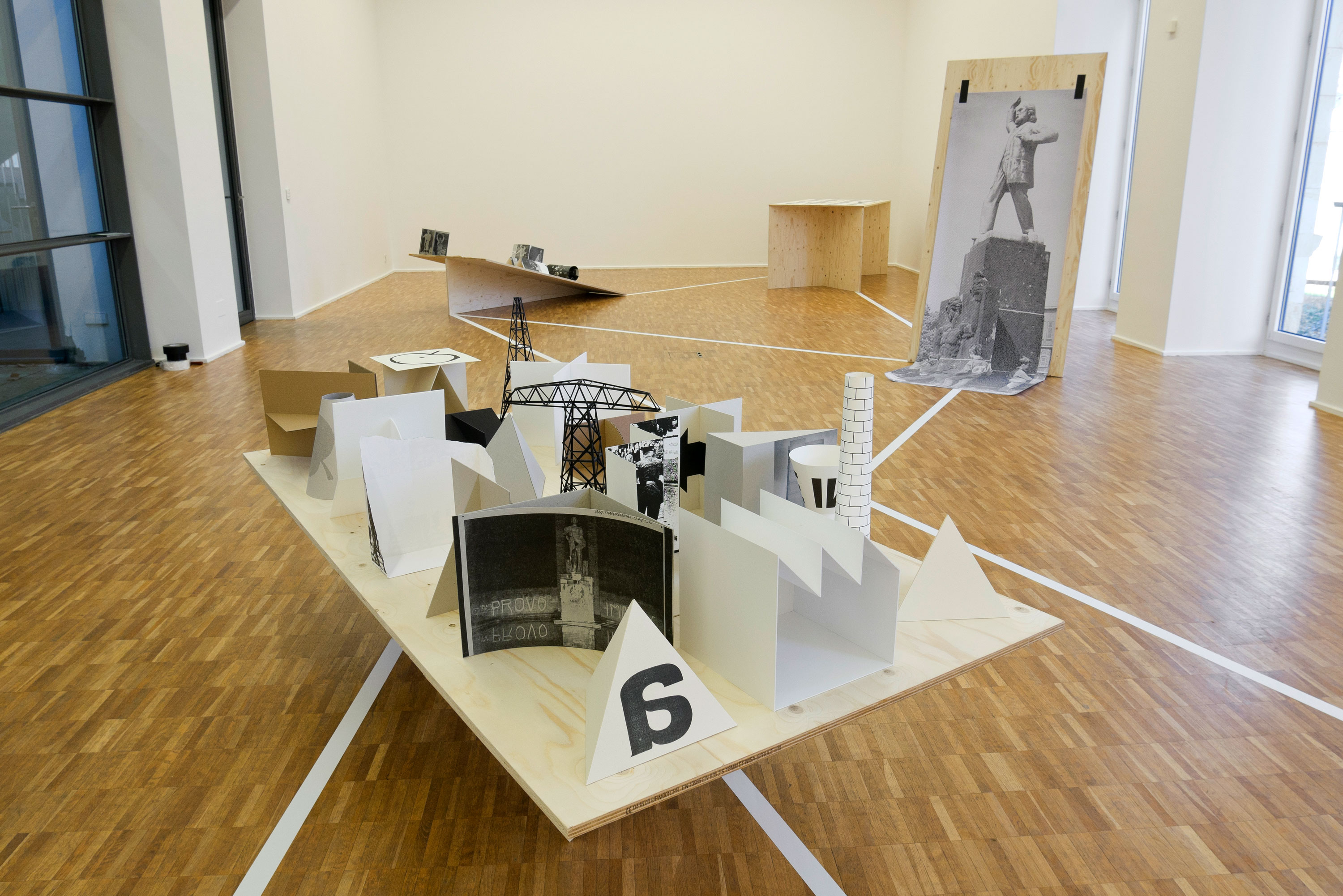
Installation ‘Models for a Provotarian City’. Solo-exhibition at GfZK, Leipzig, 2016.
