Making a Website: What a Photographer Can Learn from a Designer
As dozens of editions reported on October 21, Marty McFly who would have arrived from the past on that day, would have been dissatisfied with our achievements today. We did, however, make some progress: we learnt to control the cockroaches with the help of our cell phones and talk on the phone right through our watch. Also, it became easier to create an online portfolio. Many publish them on Tumblr, Flickr or Instagram, but we want more. A portfolio on a website with a personal domain and unique design is a status thing. Web designer Sasha Astron helps you understand how a photographer can become a couple of centimeters more professional in the eyes of the client.

Instruments
Look, Marty, we now have a good set of online instruments with well-made templates, which allow a photographer, a designer or other visual arts professional piece together a decent presentation. Their difference is in the constructive elements of various difficulty levels and presence or absence of various additional services such as analytics or a possibility to integrate the online store to sell the works. Let’s briefly meet the most interesting instruments.
Portfoliobox is noteworthy for the wide range of functions and a built-in online store. It is available for free in a service package with limited available templates and number of posts. The Pro-account costs $6.90 a month. It has no limitations, allows one to connect to a domain, Google Analytics and other options.
It is even easier to set a template in ALLYOU. A subscription complete with a domain and additional options costs $8 a month. A stripped-down free version is also available.
Semplice is a very flexible instrument. It allows one to create a portfolio with animation, parallax and other visual effects. It has been made mostly for designers, but there is nothing that would prevent a photographer from using it. A lifetime purchase costs $89.


The two following platforms are social networks for professionals in the creative sphere, which offer an additional option to arrange your presentation on a separate website. Their advantage is in the access to a big audience of professionals. It is worth registering at least a basic account here for networking and building up a reputation.
Behance is populated with designers, illustrators, photographers and architects. To start using the Pro Site service, you need a subscription to Adobe Creative Cloud: Single App or Complete for $19 and $49 a month. You get a tunable website on a personal domain and a portfolio synchronized with your Behance profile.
Сargocollective community values quality and fresh ideas in creative work. It has no ‘Register’ button. To join Cargo, you need to write a short letter to the administration with a short self-introduction and a link to your works. The basic account is free, the domain and bonuses cost $9 a month or $66 a year.


The other options are imcreator.com, dunked.com, carbonmade.com, viewbook.com — let us now however turn to our main problem.
How do you interest your viewer with your presentation and content?
Content
If you need a website to not only to put on a show, but also to earn money while doing the thing you love, then its direct goal is to attract new customers. That is why the first thing that is worth thinking about is who they are. The imaginary image of an ideal client will help you set the tone and emphasize what you need to be emphasized.
To be noticed in the world of information noise and clip thinking you need to send a clear and understandable signal. There is no time to explain, you only have 2-3 seconds before the user decides whether they will browse the website for a bit or close a tab. A capacious, easily distinguishable message helps you stand out in the stream of data and engage the user for another minute or two.

Positioning
Not all clients are equally useful. It is a good idea to publish on the website only those photos that characterize the author’s style and manner best. This helps narrow the audience and aim at the relevant people. Positioning is not only about marketing, but also about higher level values. Attract clients that you are psychologically comfortable working for. Masterpieces are born when the person purposefully comes for your work. “Bring it on, like you can” is the best thing that a client can wish for you, if they want to work together with a motivated ninja. Specialize in what turns you on most of all, in what you are really good at.
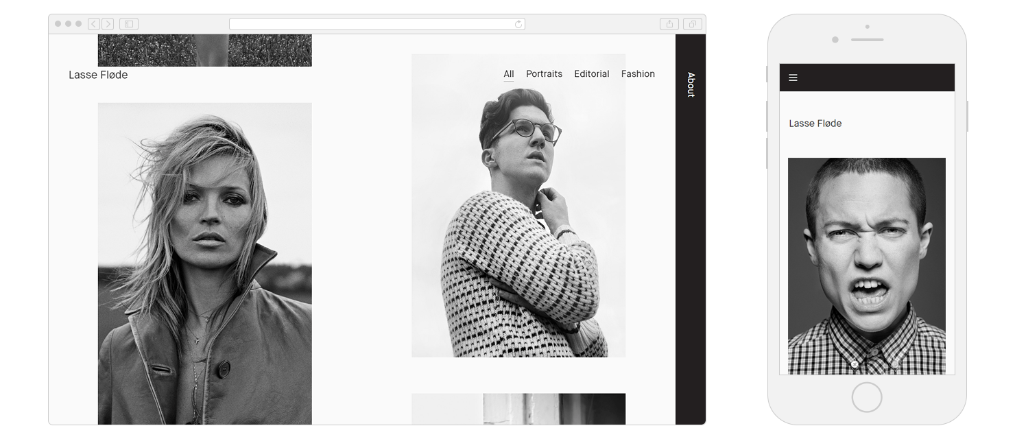
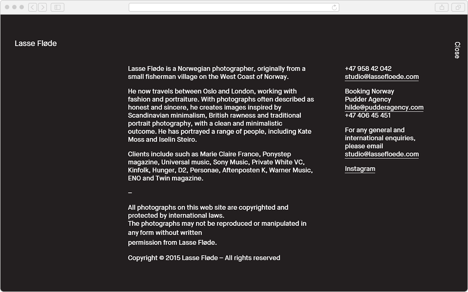
Here, have a look at Lasse Floede, the master of the fashion portrait. They call his works honest and sincere. Lasse finds inspiration in Scandinavian minimalism, traditional portrait photography and British humidity. His website speaks for itself.
Creative activity requires hard brain work and strong inner motivation. When you are happy doing what you love, this happiness can’t be mistaken for anything – this is our fuel and our vulnerability. Creative individuals are greatly dependent on their emotional state. If your communication with the client is not working out, you are likely to get a mediocre product as a result.
To maintain a creative erection you need a harmonious relationship and mutually beneficial partnership. Designers criticize their clients for ‘make my logo bigger’ not because it is very difficult to make it bigger, but because you can tell a good client by the way he puts himself in the confident hands of the professional, and then relaxes and enjoys it. A professional knows better.
When your portfolio resonates with the strings of your client’s soul, there is a bigger chance for mutual understanding. You know your strengths and what makes you feel good. The only thing that is left is to turn it into a visual manifesto.


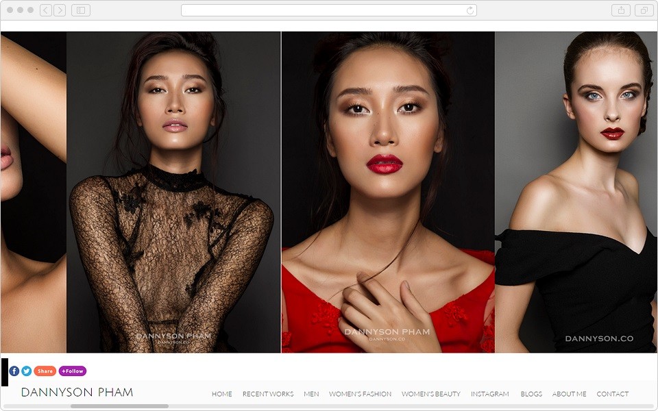
Amanda Pratt’s website is a good example of a concise presentation. It greets the user with a large photograph and introduces the author. There is nothing else you need. While the guest is looking around, the slideshow shows him the next image. You can recognize how the photographs are all taken in a similar style. The drop down menu tells you what genres Pratt works in.
Good Design Is As Little Design As Possible
The amount and type of data that we see on the screen is not typical for human perception. Our species formed in the wild African savannah — we are used to spotting a leopard in the bushes and not buttons in a design thicket. This is why it is always difficult for the user. Working with the majority of websites causes a lot of negative feelings, and therefore, according to the current trends, the simpler the design, the better.
When you introduce yourself, don’t get too deep into biographical details. It is better to concentrate on the most important information: positioning, key achievements and values that you practice. Try to provide concentrated information in small portions.
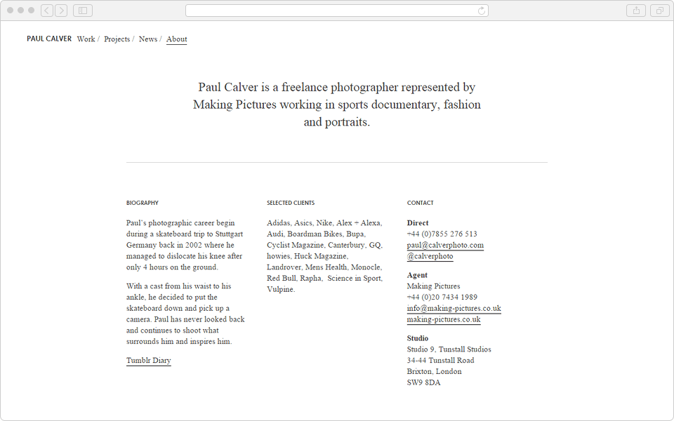
If you list your renowned clients, it serves as a good indicator of your status and helps shape your professional profile. Adidas, Asics and Nike among your clients hints that you are good in the sports sphere. And Ponystep magazine and Universal Music prove that you have a talent for taking pictures of pop stars.
Common Gaffes
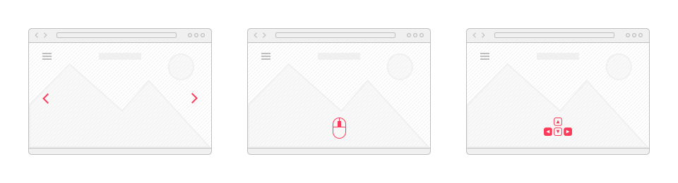
Photographers’ websites have several common usability mistakes. First, you should stay away from the horizontal scroll. It is not the way the user usually scrolls, and unusual interface is always annoying.
It doesn’t hurt to ask “Do I even need a preview?” and “Aren’t they too small?”. Here you see a classic example of the unfortunate use of thumbnails, as in the format like this they fail to make a viewer interested.
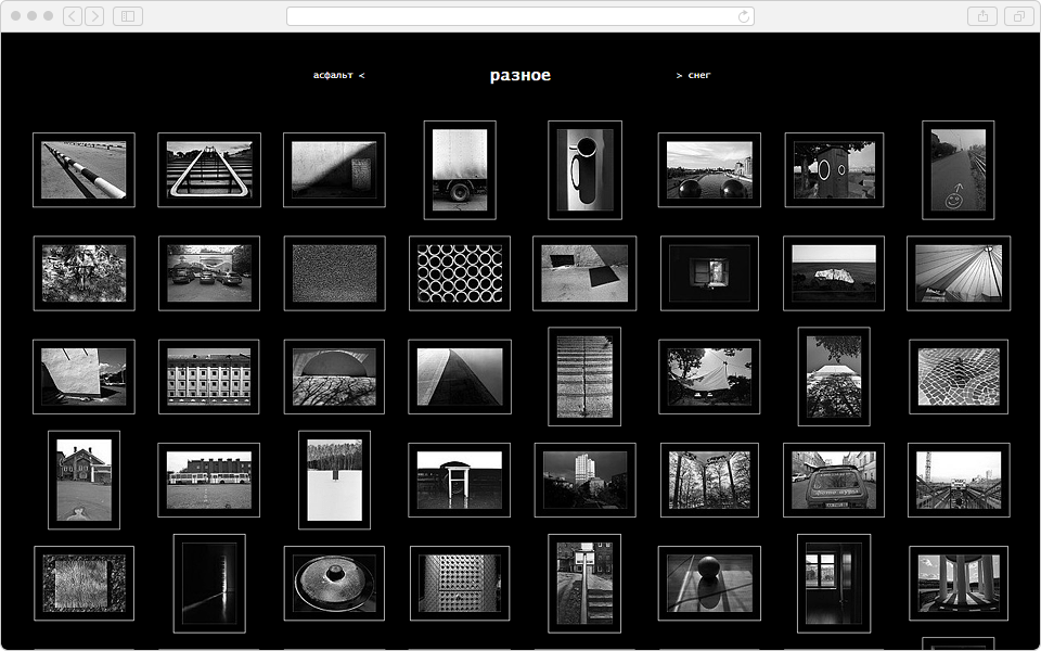
And this is the main page — and it is also a fail. A roulette of equivalent elements makes it impossible to make a choice, so you have to close the page.
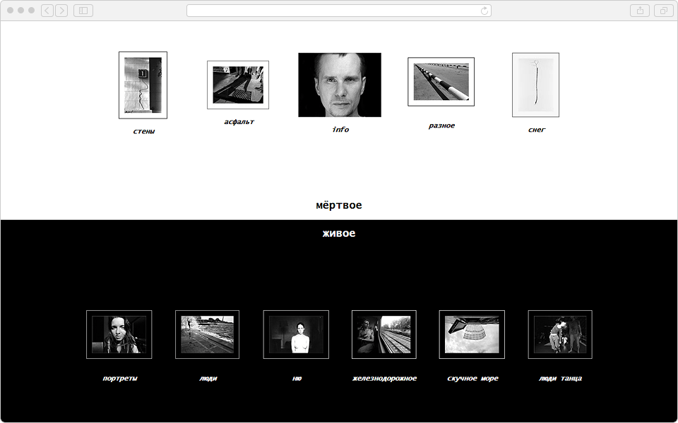
You need to highlight only the main thing on the screen. Everything else is the hierarchy of minor elements. Like in primate groups when the alpha male is large and noticeable, and other males are in the background. The highlight needs to be made with a verb, which denotes a priority action — for instance, “see photos”.
It is logical when the visitor is greeted by one full screen work of the author. The next common mistake is when it is not apparent what they need to do to see more. Scroll, click, drag, consult the menu? It is good when the website supports navigation with keyboard arrows. This is convenient. But you should also make easily noticeable hints about possible actions.
Trust Your Senses
Convenient means familiar and natural to your body. Biology is the foundation stone of usability. Try for your website to be predictable. The nervous system adapts to the logic of popular interfaces and reacts to the stimuli automatically. When the visitor can’t get the desired result on autopilot, their brain receives a chemical punishment and they start stressing a little. Every little mistake is followed by a drop in mood. Test your project on live subjects and observe the reaction. The user needs to get what he wants and minimize his pain as much as possible. If you do everything right, the pilot version of your website will invoke positive emotions and bring you new clients.
Related Posts

New and best