Scroll, Glitch and Virtual Reality: Art Directors Name the Main Trends of 2016
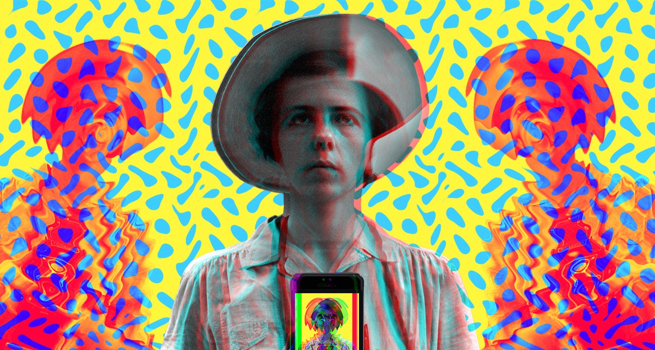
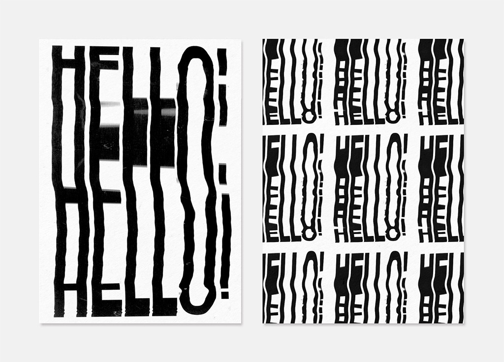
It looks like 2016 will be a year of big changes. It seems like the established system has failed in all spheres of life. Glitch aesthetics — the aesthetics of jamming and noise, which took over the visual field — reflects this chaotic change.

— I think it is interesting to try to imagine how mobile technologies will influence commercial photography. We’ll have lookbooks of famous brands, featuring photographs taken with mobile phones and edited in Instagram. Distorting mirrors and colored glass will be used more actively in portrait shooting. It is worth paying attention to unlikely combinations, such as capturing food or hats with the help of drones.
There is also an absolutely opposite trend — creating illustrations from real materials and objects. These are appliques, modeling clay, origami, experiments with printing, woodwork and metalwork. I noticed that 80% of works at the end-of-semester exhibition of the illustration course at the School of Visual Arts at NYC were created without the help of a computer.
There is too much digital graphics around us, and I think that more and more artists will be looking for new techniques, which use classic materials or everyday items at hand.
Mixing folk motives and fashionable vector techniques, such as cross-stitch and icon-based line graphics or Petrykivka decorative painting and flowing semi-transparent forms with minimum colors, will fulfil its potential. For example, English illustrator Matt Blease creates simple, clean, and at the same time capacious images.
The main trend in video are films and clips, which you can view with the help of cardboard. Last year I acquired a virtual reality device, but currently there is a very limited amount of interesting content for it. It would be cool to create a video where you could turn the view 360°, like in Bjork’s Mouth Mantra, and influence the plot, like in Coldplay’s Ink.
When it comes to graphics, the first in trends are iPad illustration and experiments with brushes. New iPad Pro with a pencil and a mobile Creative Cloud allow you to create great illustrations. In the past year I’ve met more and more guys who are drawing on their tablets even as they are taking the subway, and their work is at a very serious level.
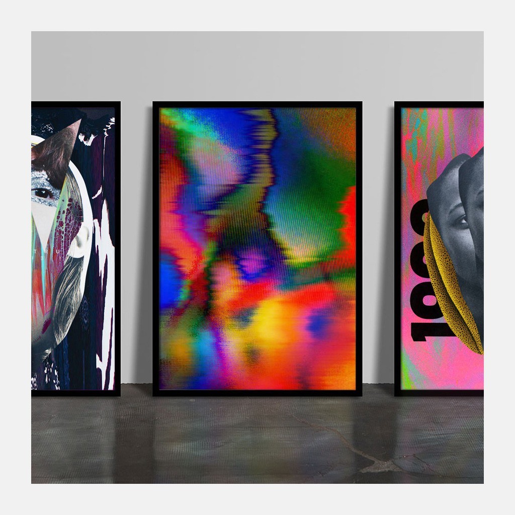
— Terry Richardson and his point-and-shoot camera are in the past, long live Nick Knight and Glitché. Nobody needs the familiar world anymore — the place of glossy substitutes is in the trash. Surreal worlds with distortion, noise, errors and defects — this is what is natural for the contemporary person. The world is ready for the psychedelic revolution in all its forms, and the creators of commercial images simply can’t ignore it.
The means of expression will definitely become more complicated. We are ready to perceive huge amounts of information, and this had to influence visual culture. The sterile minimalism became too primitive and died, the new baroque epoch came instead. Google will lead in the outside appearance of digital products. They are extremely universal, which is the most important thing today.
iPhone and VHS tape, which we’d already buried, will yield better results than expensive equipment and post-production in the studio. All means possible will be used to keep the viewer’s attention: it doesn’t matter if these are effects from the future, nostalgia for the past, or a bad quality GIF smeared across the screen. Nobody will be spared, as information will be enclosed inside the image with the help of a visual code.

and Creative Director, San Francisco
— The workflow of interactive design has always been a middle ground between producing static / editorial comps and creating motion graphics compositions. Motion has been largely used for short scope campaigns and content light sites, while an editorial design treatment has been the chosen one when it comes to content heavy sites. However, describing interactivity through static comps or motion graphics has always been a huge communication challenge.
In 2016 we will continue to see more and more motion based interfaces.
This gap has been covered by static and interactive style sheets, animation tools, and in recent years, prototyping tools. The results of this new trend have already started to appear and will develop even further this year. We’ll see interfaces where motion is so natural to it that it wouldn’t make sense to analyze them as an editorial composition. Just have a look at Because Recollection.

— We’ve been talking about it for years, but 2016 is going to be the year that institutions finally accept the fact that users will scroll through their content. I believe that we can thank platforms like Facebook and Instagram for this. Users now expect scrolling everywhere they go, and often test pages when they first land to see if they react to this behavior. This acceptance will allow designers to weave longer narratives than before. Rather than cramming the area above the fold with everything a user might need, designers can allow users to discover content on their own. We’ll see rich long-scrolling experiences that employ storytelling tactics of pacing, suspense, climax, and resolution.
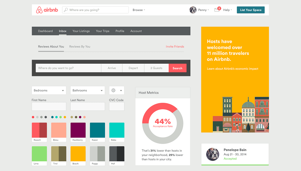
In 2016 designers will pay more attention to the larger systems they are designing than the visual treatment of each individual element. They’ll understand that changing a single element has effects all the way up the atomic chain, and that changing a pattern will ripple down to the elements. We’ll see larger institutions employing this approach first in an effort to standardize their products and create design systems that work, even as team members come and go and features are added. Design agencies will be engaged to not only design products, but the systems for those products, as well as the interactive guides for using those systems. Companies with multiple lines of business will finally have a standard design approach to their products, and individuals will actually look forward to engaging with them.

— Glitch became a reflection of changes. A giant amount of information, transferred by air, replacing humans with robots: all of these are great until the first glitch. Glitch-art is a reminder that you can’t succumb to the excess of technologies that are powered only by electricity. Most probably, glitch-art will dominate in 2016.
We are bored to death by the phrase ‘at the intersection of art and technology’, but this state will last for a long time, if not forever. Breathing fabric, dresses from 3D silk, drone directors, digital projections and, of course, Oculus Rift — we are only starting to implement all of these in practice, and who remembers dial-up modems anymore.
New and best
