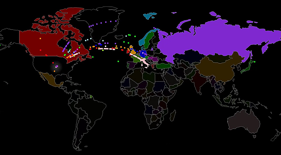
Infographic: Main Flows of Refugees in the Past Three Years
Every dot on the map stands for 500 asylum seekers.
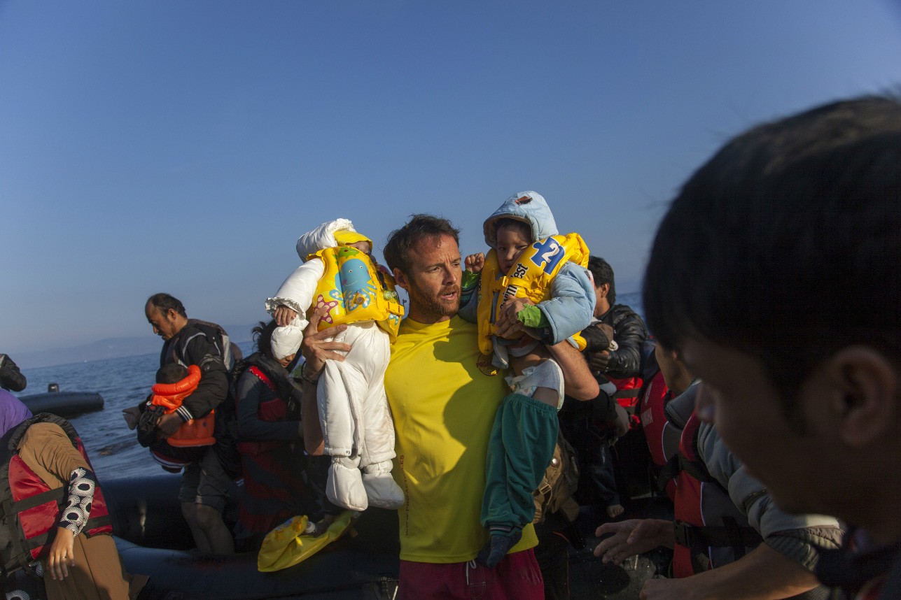
Max Galka, the author of Metrocosm, published an infographic where he showed where asylum seekers applied for asylum in the past three years. The visualization is an interactive map of the main migrations flows — it shows where the majority of migrants come from and where they are heading.
The author of the infographic says he based the project on data from the UN Refugee Agency, which says than between 2013 and 2016 there were over 4.4 million people who applied for asylum in the industrialized world.